Turning my last.fm scrobbles into a transitions network to detect patterns in my music-listening habits.
Intro
Playing around with some network packages I came across graph-tool and its capabilities to detect Stochastic Block Model structures in transitions data. I wanted to test out these ideas in a large dataset, so I decided to use my last.fm scrobbles to analyze the information on how I jump between artists in my day-to-day life. Specifically, I wanted to see if there were patterns in how I go from artist to artist whenever I am listening to music.
Code Description
Dataset & Cleaning
We will be working with an updated version of the dataset described in a previous post. A small sample of the data looks as follows:
Artist              Album               Song                    Datetime

John Moreland       In The Throes       Your Spell              2022-06-17 21:02:00-07:00
Eels                Shootenanny!        Rock Hard Times         2022-06-17 20:58:00-07:00
The Lumineers       Cleopatra           Gale Song               2022-06-17 20:40:00-07:00
John Moreland       High on Tulsa Heat  Losing Sleep Tonight    2022-06-17 20:35:00-07:00
...
Fort Atlantic       Fort Atlantic       My Love Is With You     2022-06-17 20:12:00-07:00
Fort Atlantic       Fort Atlantic       There Is Love           2022-06-17 20:08:00-07:00
Caamp               Lavender Days       Lavender Girl           2022-06-17 20:05:00-07:00
Houndmouth          Good For You        McKenzie                2022-06-17 20:02:00-07:00
The full initial dataset contains more than 180,000 entries before data cleaning, and represents the music I’ve listened to on my personal devices over the period dating from before 2012 up to mid 2022. Now, there’s a slight caveat with my original that and it is that all the data prior to 2012 was registered and transfered from a previous username to a new one. This caused the data from before 2012 extremely messy, with dates assigned to 1970; hence, we will only be using the data from my current username (2012 and after).
To clean the dataset there’s another couple of things we need to take into account. The first one is that there are “artists” that are not really artists (such as podcasts, or videos), which were sometimes scrobbled to my last.fm account. To filter out these cases, we use a “ban list” that gets passed to our script and eliminates all the artist matches. It’s also worth noting that I am focusing on my English-speaking music, so all Spanish-speaking bands were added to the ban list for now.
Now, there are some error sources in the data. One of them is different naming of the same artist (for example, “The Smashing Pumpkins” and “Smashing Pumpkins”). In the case of my dataset it was easy enough to clean by hand by providing a mapping dictionary, although it could have also been fixed with the musicbrainz data that I’ve used in other applications.
Finally, there are situations in which it seems that I left some playlists on repeat, which artificially inflated their count. To fix this, I defined a daily interval and deleted the day information of artists that were played by an amount that seemed unlikely to happen in a “natural” situation. I decided to use an upper bound of 100 plays in one day, which would mean that I’d have to listen to that artist for around 5h in the interval (assuming each song is around 3 minutes long), which seems high enough to be somewhat realistic (given that I work constantly listening to music); but also a good point to say “ok, maybe I just left my device on repeat”. It’s worth noting that there are better ways to determine this (as detecting the pattern of songs), but for our analysis the threshold is good for now.
After all the data cleaning we still have around 165,000 entries to work with in this analysis.
The Network
The most important part of this work is the network. Initially, I was just calculating transitions between artists as: “if I listen to artist $a$ followed by artist $b$, it should count as a transition”. The first thing I noticed, though, was that this would also count transitions that ocurred over timespans that would be too large. For example, if I listened to artist $a$, then went away and started listening to artist $z$ 8 hours later, it should probably be assumed that there was no correlation between me listening to artist $a$ and then wanting to listen to artist $z$ after such a long period had elapsed. To avoid this, I defined a timedelta between transitions for them to be valid, so from this point on, all the transitions that will be discussed asume that if the play-events happen in a timespan longer than one hour, they are discarded.
The second thing that I noticed was that the requirement for contiguous plays for them to count as transitions is too strict. For example, if I listen to the following artist sequence: $a,b,c,b,a,b,c$ ; only counting immediate plays as transitions, artists $a$ and $c$ would never be correlated even though they probably should (given that they appear often in an n-gram fashion). To alleviate this in a simple way, I decided to define a weighted sum in which the distance between the artists defines how much that transition contributes to the network. In a more formal way, I defined the transitions between two artists $i$ and $j$ over a window sized $s$ that starts at entry $t$ in the database as follows:
\[\tau^{s}_{(i\rightarrow j) @ t}=\frac{\left< i_{t}\rightarrow j_{t+1} \right>}{1}+\frac{\left< i_{t}\rightarrow j_{t+2}\right>}{2}+...+\frac{\left< i_{t}\rightarrow j_{t+(s-1)}\right>}{s-1}+\frac{\left< i_{t}\rightarrow j_{t+s}\right>}{s}\]where I’m using $\left< i_{t}\rightarrow j_{t+1} \right>$ to denote the presence or absence of a transition between $i$ and $j$ at a distance $t$. To generalize this idea for all the $i\rightarrow j$ transitions over the dataset we iterate the previous idea over all the entries in the records ($l$):
\[\tau_{[i,j]}^{s} = \sum_{t=0}^{l-s}\sum_{w=0}^{s}\frac{\left< i_{t} \rightarrow j_{t+w}\right>}{w}\]This process is then repeated for all the artist pairs to calculate our full weighted squared matrix $\tau^s$. It is worth noting, however, that the code implementation fills this matrix in a different way, by calculating the independent artist-to-artist matrices in sliding windows of size $s$ and then doing their weighted average accordingly (which is more computationally efficient but more difficult to describe mathematically).
Once we have our transitions matrix $\tau^s$, we calculate the probability matrix by normalizing the matrix row-wise (where the rows are indexed by $r$, and $c$ is the number of artists, or columns):
\[\beta^s=\sum_{r=1}^{c}\frac{\tau^s_{r}}{c}\]And, finally, as we are interested in the transitions between artists, we set the diagonal of our matrix $\tau^s$ to zero (no self transitions).
Frequency Rank
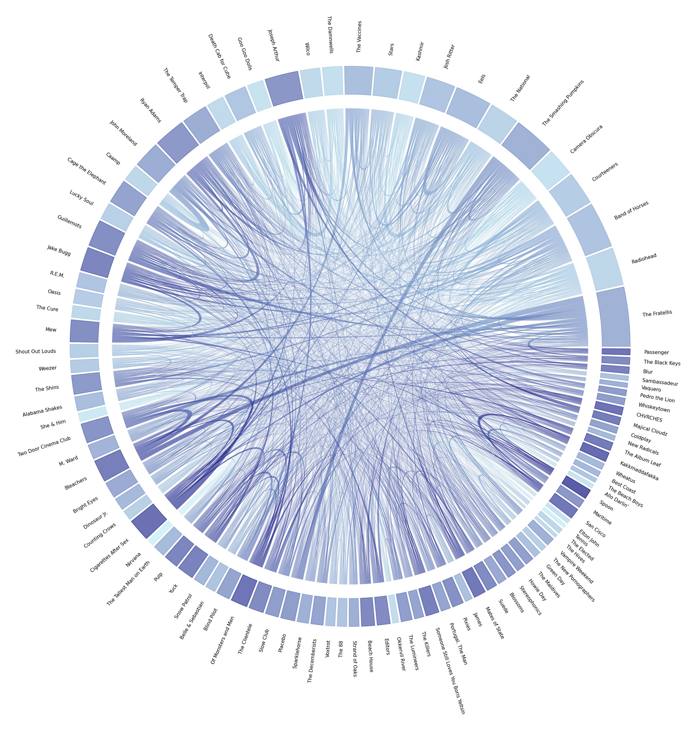
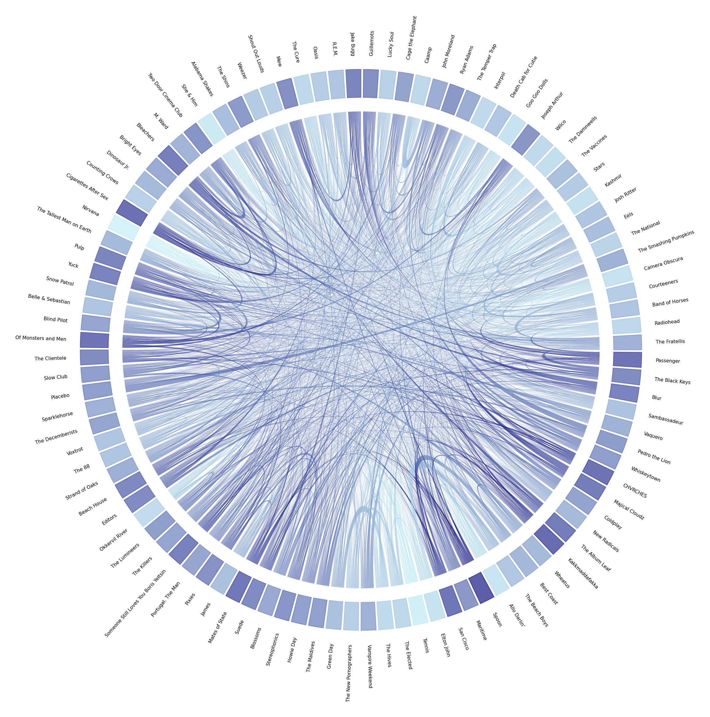
A nice way to visualize transitions data is through a chord diagram. In this representation, the categories are depicted in a circular axis and the connections between them are represented by arcs that connect them with their relative frequency mapped to its width. In our paticular application, the artists are mapped to the circular axis and the transitions between them are shown as the arcs.
The first thing on the process is to reduce the number of artists to be displayed, as plotting over 650 entries is not interpretable at all. In an initial attempt to determine a quantitative threshold I plotted the artists frequencies to see if there was a threshold in which the trend made a “jump” or was discontinuous, so that we could use that as the break-point; but the distribution of frequencies showed no such jump.

Interestingly, this playcount frequency showed a Zipf’s-like shape, which is a bit more apparent when using a $log$ scale on the $y$-axis:

Given that there was no identifiable cluster of top artists, I decided to use the 100 highest-ranked bands. Now, for the window size described in the network description I used a value of 5, which seems to provide a good balance of correlation information between artists (more on this will be described in a future post in which I will focus more on Stochastic Block Model-structure of the network).
Chord Diagram
Chord diagrams, as mentioned before, show relationships between entries in a dataset. In this case, we will use it to show the semi-immediate temporal transitions amongst the artists in the dataset. Now, we still have a couple of decisions to make to plot our diagram:
- The first decision to make is the sorting of artists along the periphery of the diagram. To encode as much information as possible, I decided to use the artists’ play-frequency rank for the ordering (the highest-ranking artist being at the 3 o’clock position and rotating counter-clockwise).
- The second decision is how to map the arcs’ colors. At first I was using color to differentiate the artists (with a rainbow-like palette), but then I decided to do something a bit more interesting. One thing that got discarded in my tests of the chord diagrams was the self-transition data. This means that the information on how often I listen to the same artist for long entries runs was not being shown anywhere. This is not a limitation of the chord diagram, as they can display this information, but a decision to exclude it to avoid the plot getting to busy and uninterpretable. For this reason, I decided to use the the self-transition probability for the coloring.
With all these variables in place, we can finally plot our diagram! We will draw both the raw transitions count chord diagram, and the transition probabilities one:
Interpretation
Some things stand out from these diagrams:
- There’s a bunch of artists such as “Radiohead”, “Nirvana”, “Kashmir”, and “Goo Goo Dolls”; that I tend to listen to in continuous sessions (identifiable by their light shading). Which does line up with my expectations, as these are artists of which I like a bunch of songs, so it’s easy for me to hit “play” and forget about it for a while.
- On the other end of the spectrum, there’s many artists like “Spoon”, “Bleachers”, and “Mew”; that I listen to in playlists mixed in with other artists (rarely do I listen to them in long bouts).
- Some artists like “The Smashing Pumpkins” and “Placebo”, or “The Fratellis” and “Bleachers”; tend to appear together, which can be explained by the fact that I’ve listened to these pairs in playlists somewhat often.
- The transitions probabilities diagram is not as readable as the transitions frequencies one.
- It is a bit difficult to make strict assertions about communities with these diagrams but groups of artists like “Bleachers”, “Cigarettes After Sex”, “Two Door Cinema Club”, and “The Fratellis”; hint at some network structures (which will be explored in the future).
Future Work
In terms of optimizations and improvements, there are some things that I’d like to improve in the near future, namely:
- To calculate the windowed matrix in a more efficient manner (traversing the array multiple times is quite inefficient).
- To determine a more quantitative-driven approach to the time-window metric (based on statistics rather than a somewhat arbitrary threshold).
- To integrate the Musicbrainz data for the data-cleaning part of the pipeline.
The next step in these analyses is to actually use the calculated network to do some community-detection and Markov explorations.
Code Repo
- Repository: Github Repo
- Dependencies: graph-tool, mpl_chord_diagram, matplotlib, pandas, numpy

