Intro
I’ve “scrobbling” my music history to lastfm since 2012 in the hopes that it’d be useful someday. In recent months I came across this blog post by Geoff Boeing, where he parses his play history and analyzes it to look for trends and do some visualizations. One idea that I particularly liked was to plot the places of origin of the bands.
CodeDev
Downloading data
At first, I tried running Geoff’s code, which is extremely well documented, but ran into some timeouts and had to look for an alternative to download the dataset. Fortunately, I found this website, that provides a GUI to download the plays history in CSV form. This CSV, however, contained a lot of plays that are not music-related (sometime in 2012 I was using iTunes to listen to audiobooks/podcasts). The first thing I did was to add ban list to exclude plays from the artists who matched those names for some basic filtering.
Geolocations
Once that was done, following Geoff’s idea, I parsed the geolocations of the bands from the MusicBrainz database. I relied on the musicbrainzngs package to do this, as it provided nice wrappers around the functions to do the calls to the database. Taking the set of artists, we query the database for both: top n genres it is classified as, and the location. This location, however, is still not a geocoded site, so we use geopy to transform it into one (using the default Nominatim setting). We now write a new CSV file with this information.
Initial map
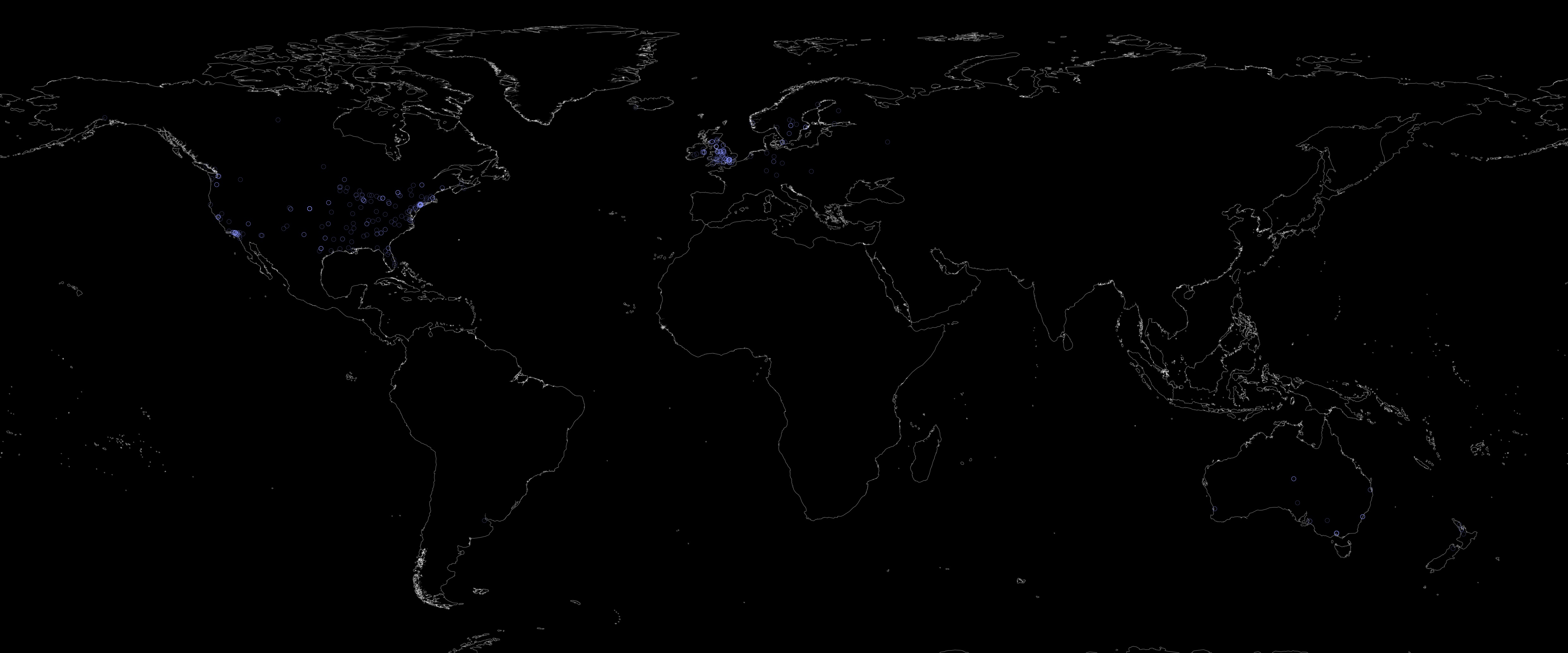
With this information I plotted the points of origin into a plain map with the following result:
Initial wordcloud
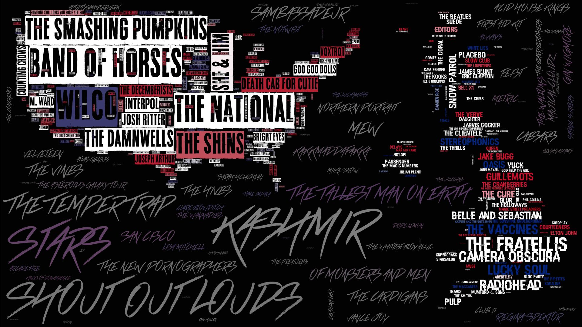
Informative, but not very flashy. The first thing that is readily apparent is that the regions I listen the most music from are: UK, and US; so I decided to focus more on those areas for the following steps. Playing around with other ideas I came across the wordcloud package, which allows the creation of masked word-clouds. I wanted to merge the idea of the geography, and the music into one same visualization, so using the countries shapes as masks with the artists names became the next logical step. I first tried to do a simple word-cloud with the names of the bands scaled by playcount:
Shapefile cloud
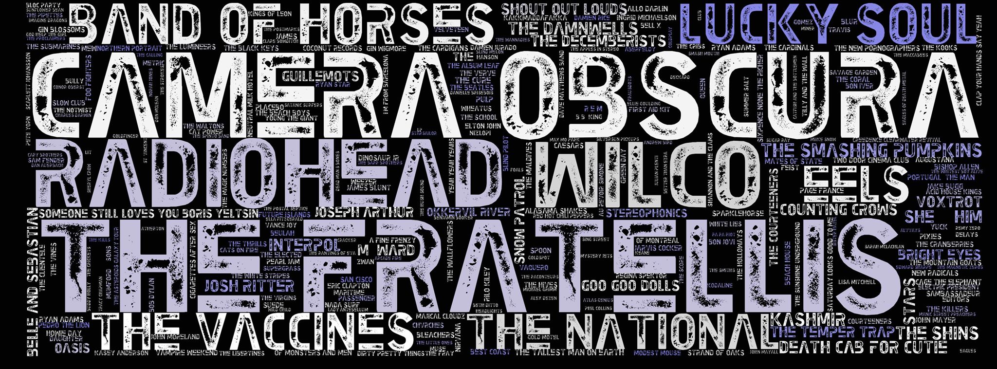
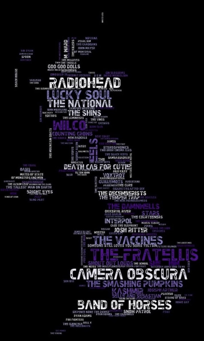
With that out of the way, the next step was to get a hold of the masks for the countries. I wanted to make the script as flexible and easy to automate as possible, so working directly with the shapefiles seemed appropriate. This, however, was a bit trickier than expected. After some google searches, I settled upon using the DIVA-GIS database. After downloading the SHP files for the US and GB, I started by plotting them on a plain map using basemap. I soon realized that I needed to constrain the plotted coordinates to certain ranges to avoid the inclusion of colonies, and minor islands (which is still one of the manual inputs of the code).
Color and font
With that out of the way, I decided I wanted to use a color palette that’s specific for each one of the regions, so I went to schemecolor and looked for the colors of the flags of these countries (I know I am grouping Ireland and Scotland to the same flag, but some of the bands don’t have enough information on their region of origin to segment them properly). Playing around with the palettes required a lot of tweaking so that there were not too many names in colors that are not readable (particularly dark red, and dark blue), but that there enough non-white ones. After a lot of playing around with matplotlib’s colormaps, this was the combination that worked best for the UK and US:
Now, I wanted to use fonts that were somewhat reminiscent of the countries they are representing. Looking around for open-fonts I came across urbanfonts. Browsing around, I came across two that I felt were good matches:
- How do you sleep?: for the US
- Hacked: for the UK
Inverted mask
All good up to that point, but there’s still a lot of bands I listen to from other countries, but not enough for the other countries to be recognizable. What I came up with was to combine them into the “background” region of the maps that are not occupied with the countries shapes. For this, I exported masks of the shapefiles and negated them in a composite canvas in Illustrator (although any other software would have done the trick).
After doing so, exported the word-cloud of the remaining bands with a transparent background, and a new font/color-scheme to make it stand out:
Finally, I put it all back together in Illustrator with some slight adjustments to the opacities of the layers:
Code repo
I’m still looking forward to playing around with my lastfm dataset and coming up with ways to visualize the timing information, dates, and more variables.
- Repository: Github repo
- Dependencies: pandas, musicbrainzngs, geopy, basemap, matplotlib, wordcloud, Pillow