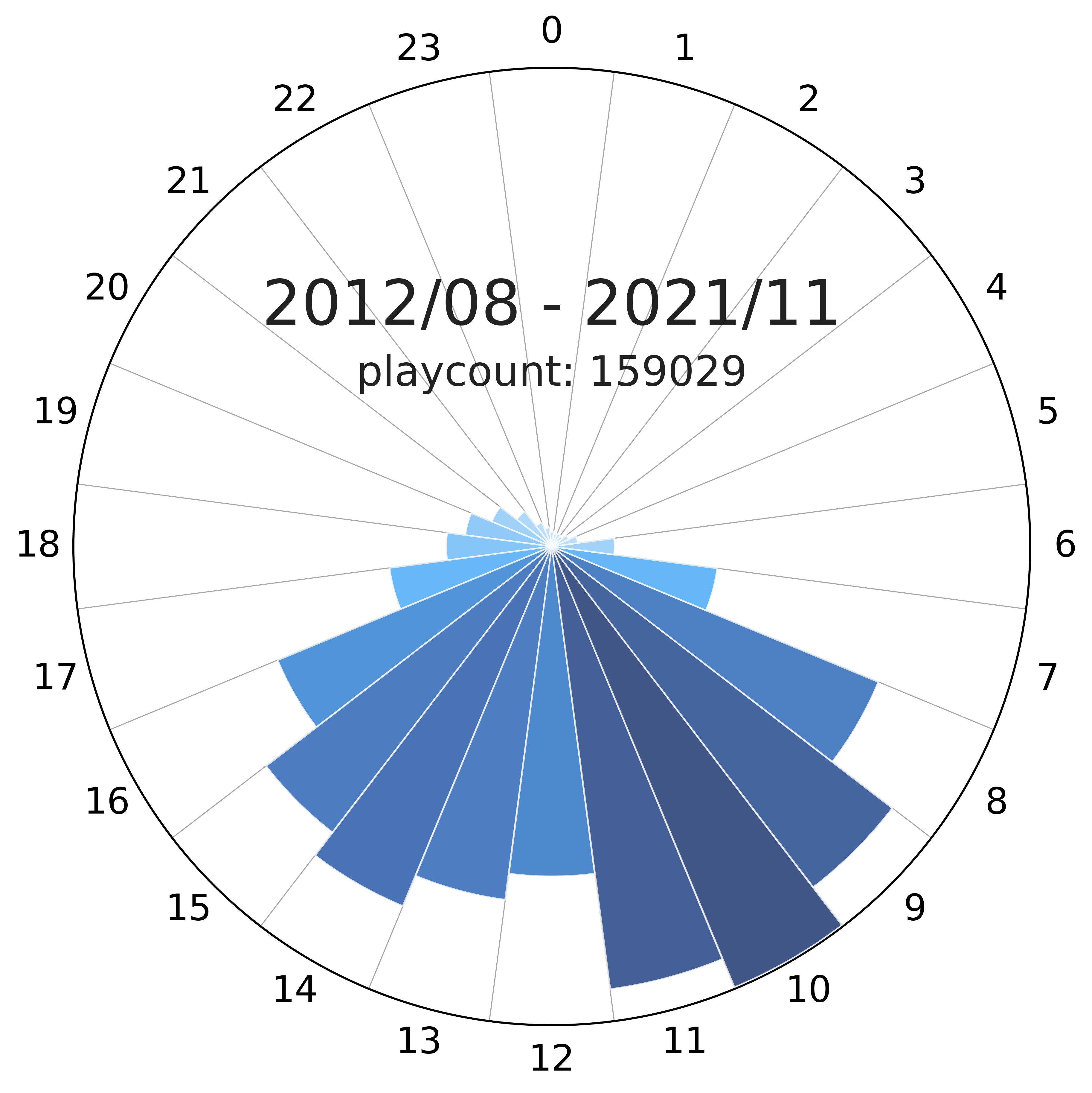
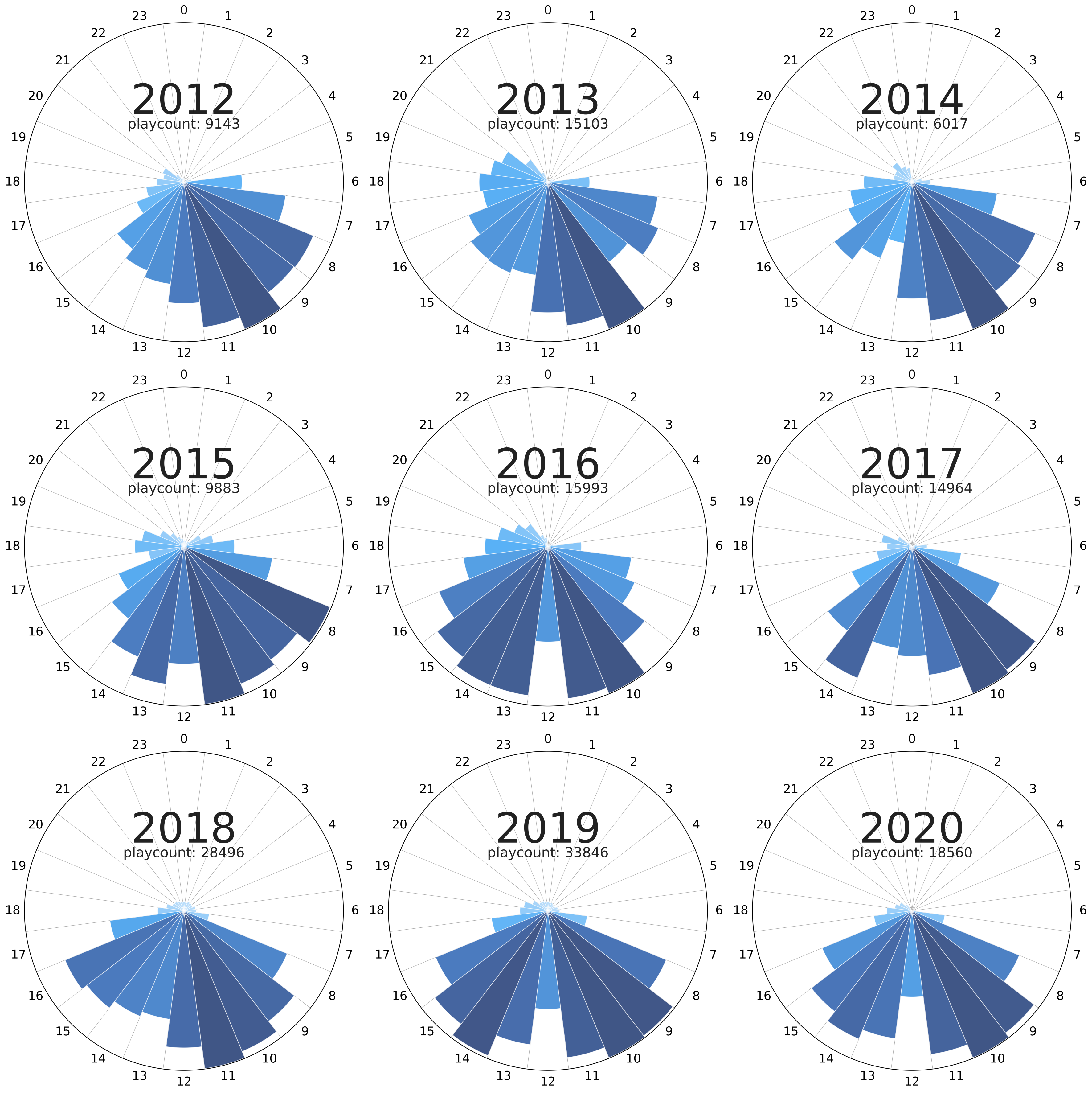
Comparing my active music-listening times over the years.
Intro
Going back to my last.fm data, I wanted to figure out the times of day I listened to the most music throughout the years. For now, the way I approached it was to generate polar plots with the binned frequencies of the song counts across the hours.
Development
Loading data
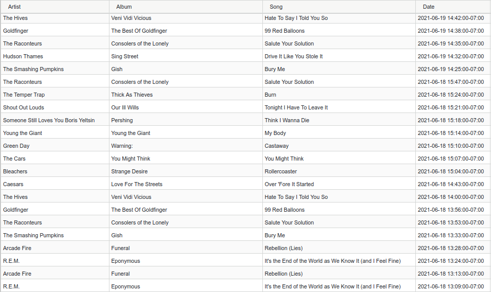
We can get started with the data already cleaned as described in my previous post in which the CSV looks like this:
We load the data and delete repeated entries (as some rows seem to be duplicated by the scrobbler from time to time):
(yLo, yHi) = ((2019, 1), (2020, 1))
(WIDTH, HEIGHT, RESOLUTION) = (3840, 2160, 500)
HOURS_OFFSET = 6
##############################################################################
# Read artists file
##############################################################################
data = pd.read_csv(
    stp.DATA_PATH + stp.USR + '_cln.csv',
    parse_dates=[3]
)
data = data.drop_duplicates()
Filtering dates
Now, we filter the specific range of time (year and month) that we are going to analyze using datetime objects:
data = data.drop_duplicates()
msk = [
    (
        (i.date() >= datetime.date(yLo[0], yLo[1], 1)) and
        (i.date() < datetime.date(yHi[0], yHi[1], 1))
    )
    if (type(i) is not float) else (False) for i in data['Date']
]
dates = data.loc[msk]["Date"]
Binning Frequencies
Once we have these filtered entries, we can bin them by hour and then count the times a song was played in the hourly interval:
hoursPlays = sorted([i.hour for i in dates if (type(i) is not float)], reverse=True)
hoursFreq = [hoursPlays.count(hD) for hD in list(range(23, -1, -1))]
Polar Plot
We are ready for the fun part. The easiest way to create a visualization that resembles a clock, is to do a polar plot. To do this, we divide the “slices” into 24 pieces and scale the radius of each slice to the playcount corresponding to the time interval. Additionally, we can create a color palette that scales with the same count to emphasize the difference between the slices:
N = 24
(minFreq, maxFreq) = (min(hoursFreq), max(hoursFreq))
fig = figure(figsize=(8, 8), dpi=RESOLUTION)
ax = fig.add_axes([0.2, 0.1, 0.8, 0.8], polar=True)
step=  2*np.pi/N
(theta, radii, width) = (
    np.arange(0.0+step, 2*np.pi+step, step),
    hoursFreq,
    2*np.pi/24 -.001
)
bars = ax.bar(
    theta, radii, width=width,
    bottom=0.0, zorder=25, edgecolor='#ffffff77', lw=.75
)
rvb = aux.colorPaletteFromHexList(
    ['#bbdefb', '#64b5f6', '#2196f3', '#1976d2', '#0d47a1', '#001d5d']
)
for r, bar in zip(radii, bars):
    bar.set_facecolor(rvb(r/(np.max(hoursFreq)*1)))
    bar.set_alpha(0.75)
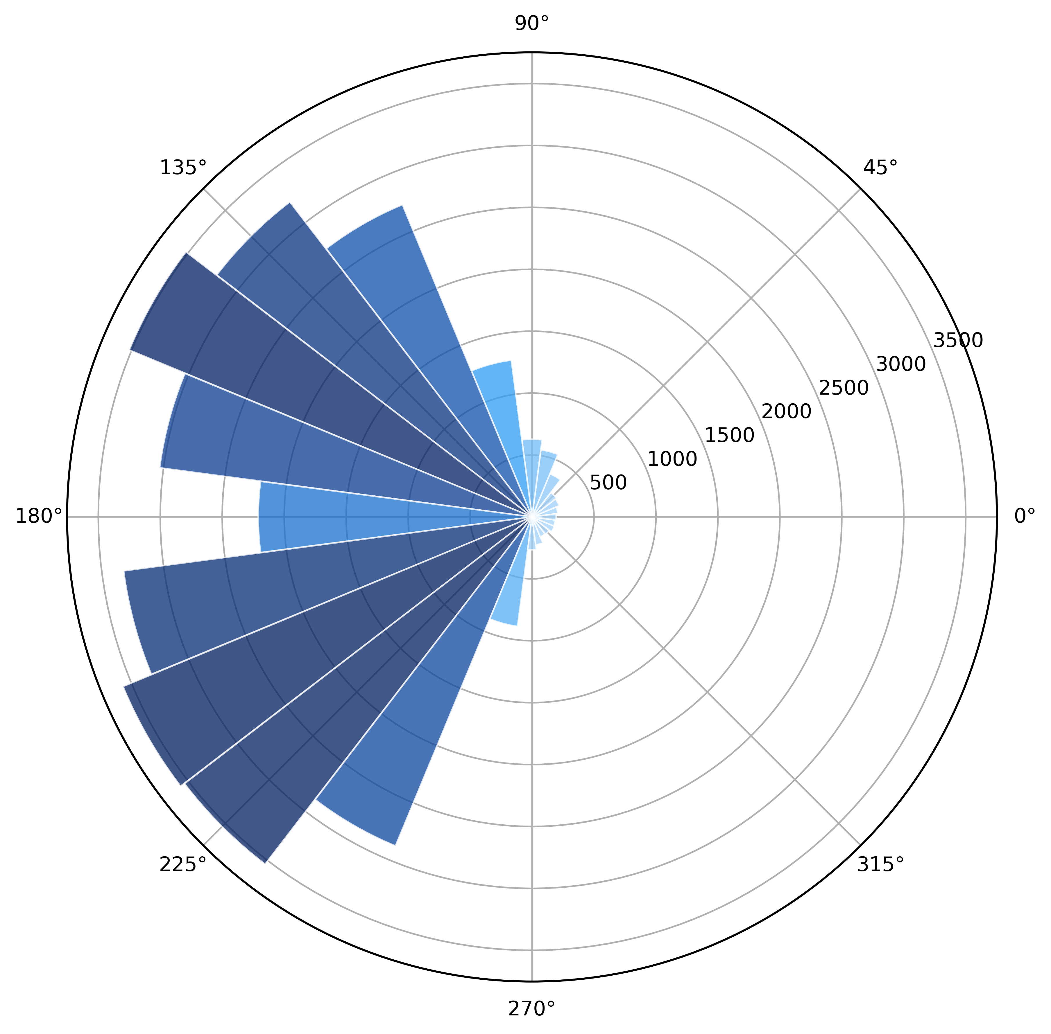
This gets us halfway there but, as we can see, this is still neither attractive, nor informative:
Axes Styling
For our final step, we are going to rotate the axes, clean them up, print a title, and add some auxiliary lines to make the plot easier to read:
shades = 12
step =  np.pi/shades
ax.bar(
    np.arange(0.0+step, 2*np.pi+step, step), 1.15*maxFreq,
    width=np.pi/shades,
    alpha=.2, edgecolor="black", ls='-', lw=.5,
    zorder=-1
)
ax.set_theta_zero_location("N")
fig.patch.set_facecolor('#ffffff')
ax.set_ylim(0, maxFreq*1.0035)
ax.set_yticks(np.arange(0, maxFreq, maxFreq*.25))
ax.set_yticklabels([])
ax.set_xticks(np.arange(np.pi*2, 0, -np.pi*2/24))
ax.set_xticklabels(np.arange(0, 24, 1))
[ax.grid(which='major', axis=j, color='#000000', alpha=0, lw=.5, ls='--', zorder=15) for j in ['x', 'y']]
ax.tick_params(direction='in', pad=10)
ax.tick_params(axis="x", labelsize=17.5, colors='#000000ff')
Gallery
Code repo
- Repository: Github repo