A fun data-analysis project with my friends to figure out our soulmates based on MK8D favorite tracks.
I’ve been playing MK8D with friends for a while now and we decided to have a bit of fun in figuring out our most beloved and most hated tracks as a group. To do so, we voted for our favorite tracks and did some data analysis to determine who were the players we share tastes with. Our so called “Mario Kart Soulmates”.
Voting Process
The first step was to ask everyone to vote in a tiered list. To have the 48 tracks organized in a neat way, we decided to have 8 tiers with 6 tracks each. My own voting ballot looks like this:
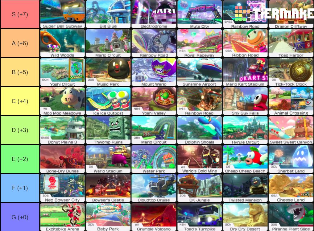
Votes Compilation and Preprocessing
With this template, everyone created their tier list and voted in secret from the other participants (to avoid biases). Once the 14 players submitted their votes, I compiled each one into lists that look like this:
CHIP = [
    ('Super Bell Subway', 'Big Blue', 'Electrodrome', 'Mute City', 'SNES Rainbow Road', 'Dragon Driftway'),
    ('Wild Woods', 'Mario Circuit', 'Rainbow Road', 'N64 Royal Raceway', 'GBA Ribbon Road', 'Toad Harbor'),
    ('GCN Yoshi Circuit', '3DS Music Park', 'Mount Wario', 'Sunshine Airport', 'Mario Kart Stadium', 'DS Tick-Tock Clock'),
    ('Wii Moo Moo Meadows', 'Ice Ice Outpost', 'N64 Yoshi Valley', 'N64 Rainbow Road', 'Shy Guy Falls', 'Animal Crossing'),
    ('SNES Donut Plains 3', 'Thwomp Ruins', 'GBA Mario Circuit', 'Dolphin Shoals', 'Hyrule Circuit', 'Sweet Sweet Canyon'),
    ('Bone-Dry Dunes', 'DS Wario Stadium', 'Water Park', "Wii Wario's Gold Mine", 'DS Cheep Cheep Beach', 'GCN Sherbet Land'),
    ('3DS Neo Bowser City', "Bowser's Castle", 'Cloudtop Cruise', '3DS DK Jungle', 'Twisted Mansion', 'GBA Cheese Land'),
    ('Excitebike Arena', 'GCN Baby Park', 'Wii Grumble Volcano', "N64 Toad's Turnpike", 'GCN Dry Dry Desert', '3DS Piranha Plant Slide')
]
Where the position of the tuple represents the tier (from highest to lowest), and every element within that tuple receives the same amount of votes (it would probably have made more sense to use a set instead of tuple for this).
After repeating this for the whole set, and adding some verification to prevent repetitions or missing tracks, the whole dataset was collated into two dataframes: a table-shaped, and a row-wise one.
Data Analysis
Similarity Metric and Matrices
With these two dataframes in place, the first thing we did was to calculate the similarity between the vote-vectors of the participants. To do this, we take each one of the votes and use it as a vector in the shape:
voteVector(playerVotes) = [x1, x2, x3, ..., x48] …where each xn entry represents the number of votes allocated to the track n (sorted globally) from 1 to 8 (the number of tiers). For example, given the global sorting:
TRACKS = [
    'Mario Kart Stadium', 'Water Park', 'Sweet Sweet Canyon', 'Thwomp Ruins',
    'Mario Circuit', 'Toad Harbor', 'Twisted Mansion', 'Shy Guy Falls',
    'Sunshine Airport', 'Dolphin Shoals', 'Electrodrome', 'Mount Wario',
    'Cloudtop Cruise', 'Bone-Dry Dunes', "Bowser's Castle", 'Rainbow Road',
    'Wii Moo Moo Meadows', 'GBA Mario Circuit', 'DS Cheep Cheep Beach', "N64 Toad's Turnpike",
    'GCN Dry Dry Desert', 'SNES Donut Plains 3', 'N64 Royal Raceway', '3DS DK Jungle',
    'DS Wario Stadium', 'GCN Sherbet Land', '3DS Music Park', 'N64 Yoshi Valley',
    'DS Tick-Tock Clock', '3DS Piranha Plant Slide', 'Wii Grumble Volcano', 'N64 Rainbow Road',
    'GCN Yoshi Circuit', 'Excitebike Arena', 'Dragon Driftway', 'Mute City',
    "Wii Wario's Gold Mine", 'SNES Rainbow Road', 'Ice Ice Outpost', 'Hyrule Circuit',
    'GCN Baby Park', 'GBA Cheese Land', 'Wild Woods', 'Animal Crossing',
    '3DS Neo Bowser City', 'GBA Ribbon Road', 'Super Bell Subway', 'Big Blue'
]
…the initial part of my voting vector would look like:
voteVector(playerVotes) = [6, 3, 4,...,7 ,8 ,8]because these were the votes I assigned to “Mario Kart Stadium”, “Water Park”, “Sweet Sweet Canyon”, “GBA Ribbon Road”, “Super Bell Subway”, “Big Blue”; respectively. Repeating this for all the players gives us a set of vectors V(player) upon which we can calculate the distances using some similarity metric (such as euclidean distance or manhattan distance). In the case of this application, we tried both the euclidean and cosine distances, both of which returned similar results in clustering, so we used the cosine metric.
With these vectors and distance metric, calculating the distance matrix was straightforward (by iterating through the pair-wise distances of each players’ tuples). In addition to this, I created a row-normalized similarity matrix (scaled from 10 to 100) so that it was easier to see who were each person’s highest and lowest matches.
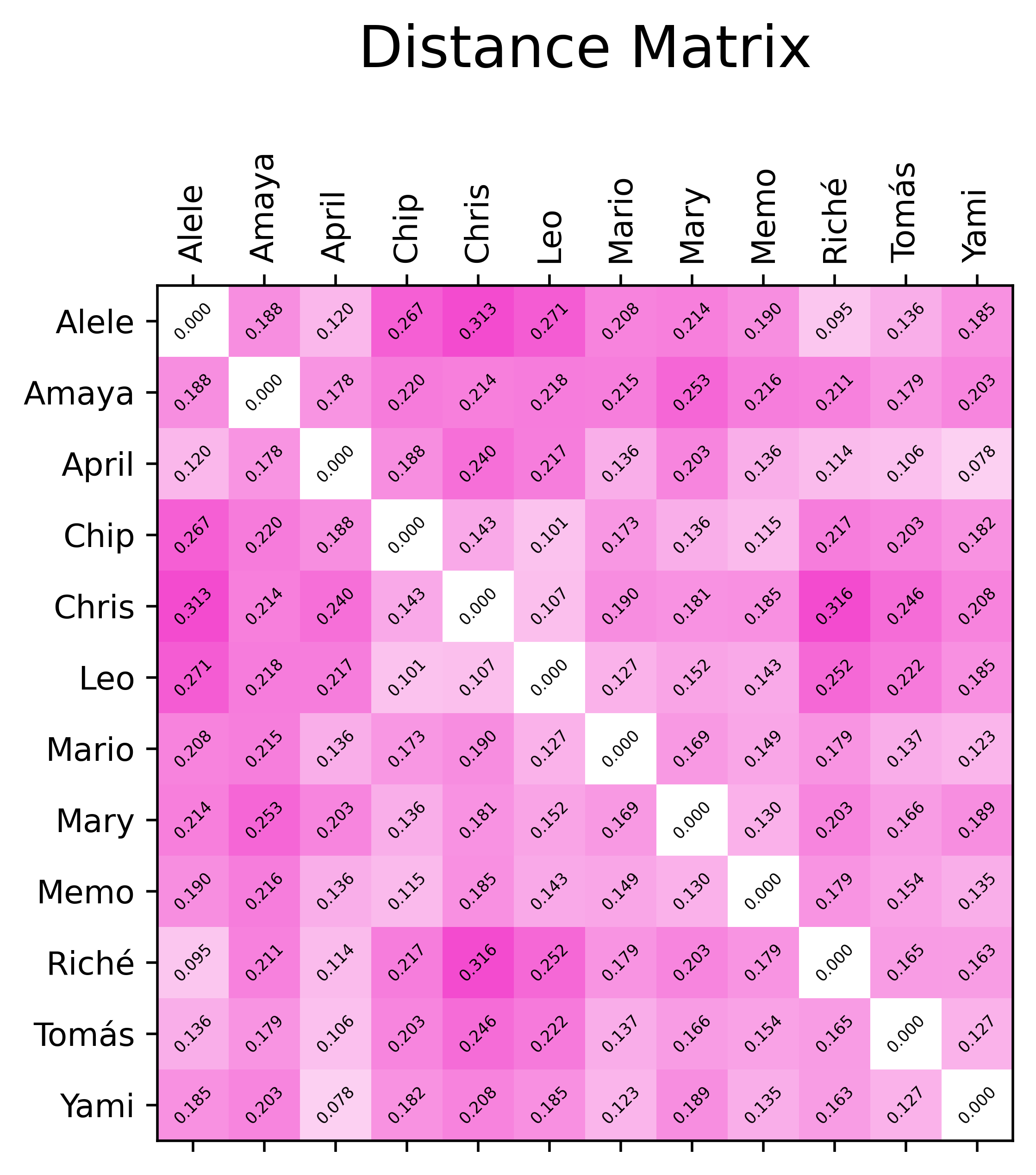
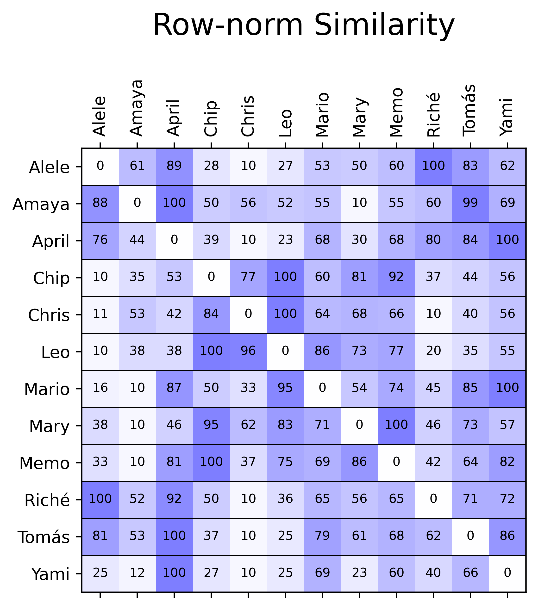
With these in hand, it’s somewhat apparent that there’s some clusters that could be calculated more formally.
Dendrogram and Chord Plot
As previously mentioned, we were curious to know how we would cluster based on our track preferences. One good way to do this is to generate the dataset’s dendrogram, for which we used scipy’s linkage and dendrogram functions with the ward distance:
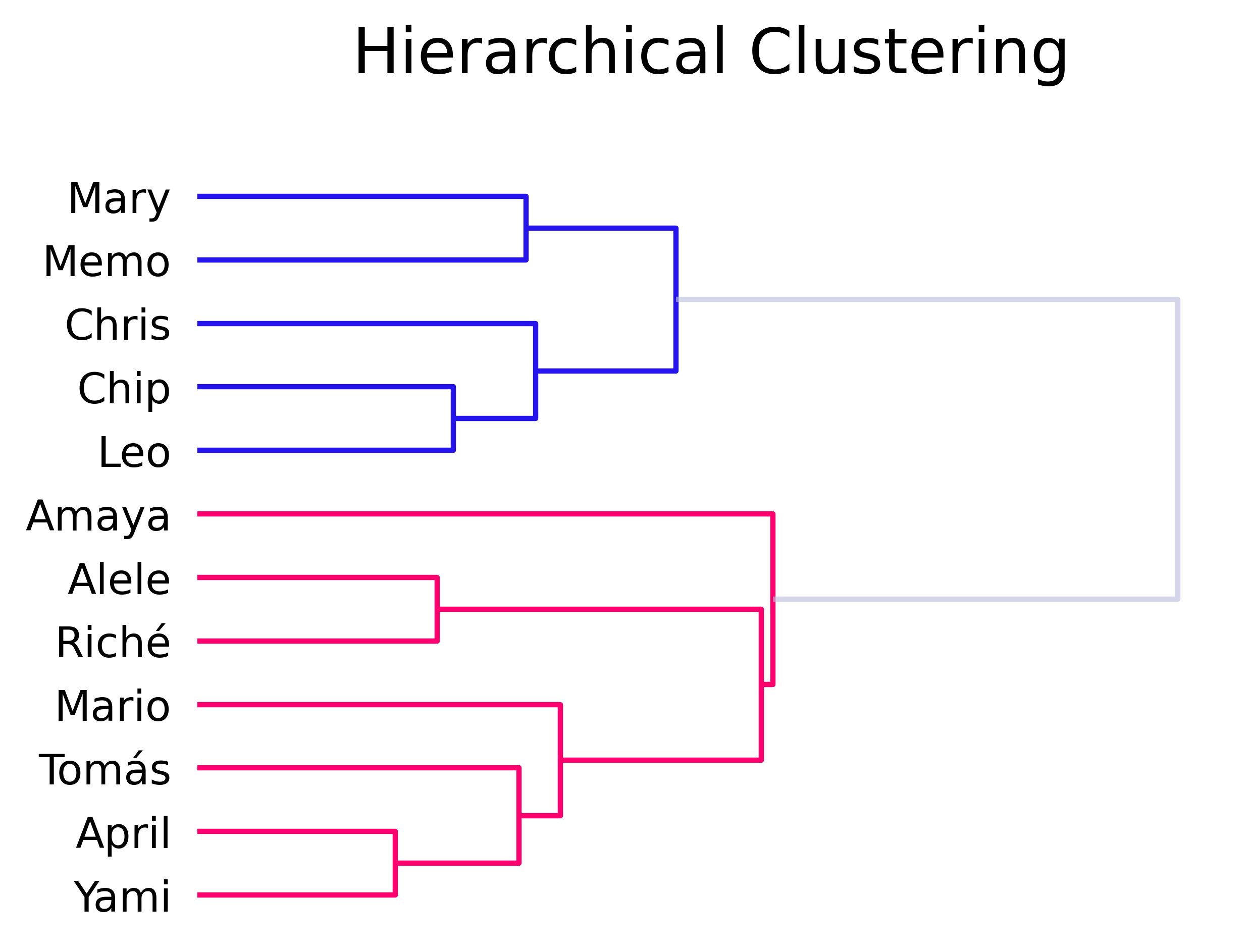
This is a pretty interesting result, as it neatly lays out what we suspected intuitively from our preferences (as we usually chat amongst ourselves when we’re playing, so we have a good idea of which tracks everyone tends to favor).
Another way to visualize these kind of “linkage” or “flow” dependencies is through a chord diagram:
Although, in this case, it’s a bit more difficult to see the relations between people. It is, nevertheless, possible to see to which persons everyone is more connected to (wider lines).
Waffle Plots
After looking at those results, it was natural to try and make some inferences about the players’ archetypes. To do this, a frequency inspection was setup. I wanted to do something new in parallel to doing the traditional bar charts or treemaps, so I generated waffle plots for each one of the tracks.
This took a bit of fiddling around because I wanted the sizes of the plots to be constants, and the labels to be in the same position for the whole deck, so I created a “padding” number of votes with the maximum frequency (most voted track). These plots were pretty useful as every morning, a track would be revealed to all the participants through one of these waffle plots (from lowest to highest ranked). The full waffles panels looks like this:
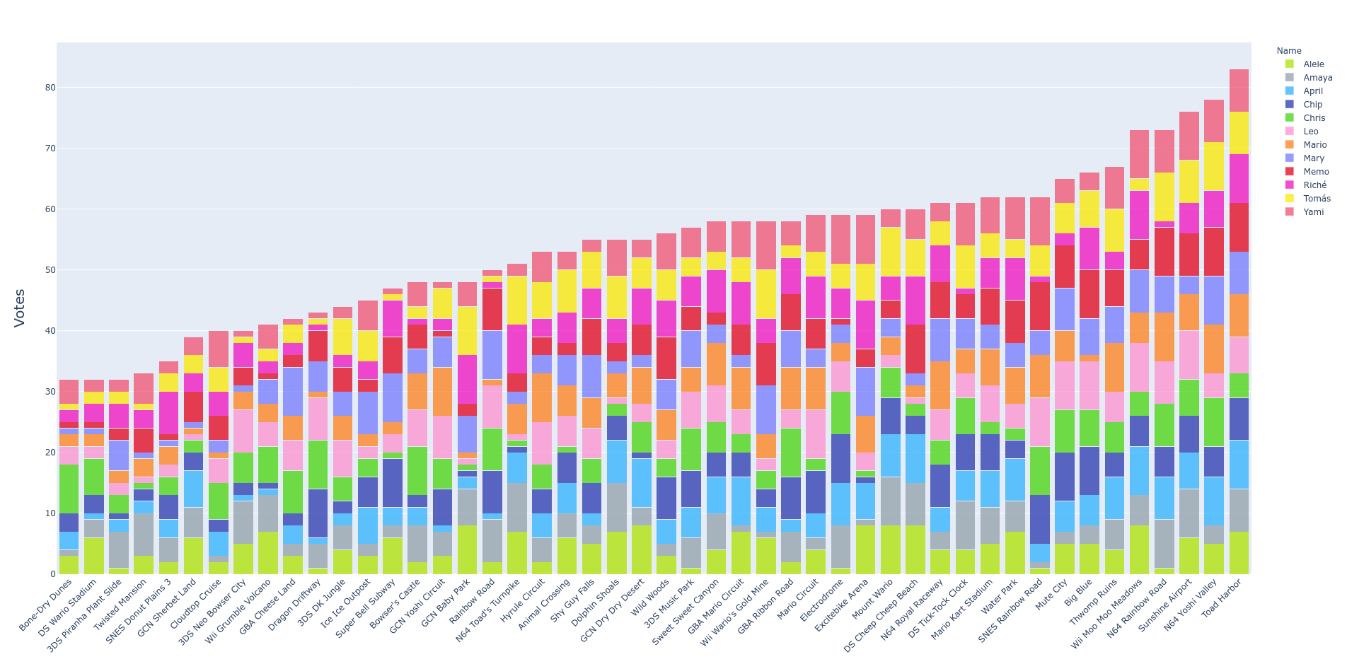
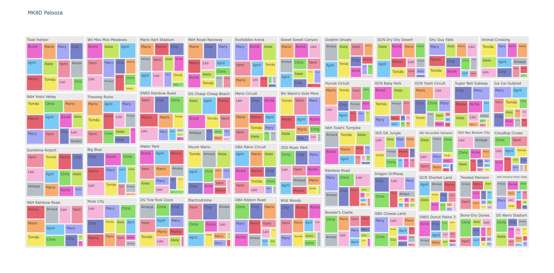
Interactive Plots
Finally, I went ahead and coded plotly versions of a barchart and treemap to make some interactive visualizations (click the images for the full-fledged version).
Results
As mentioned before, it was interesting to see that our group of friends was neatly divided into two clusters. As the results were being made public to our group, day by day, the reasons for these clusters became clearer: one of the groups tends to like longer, more sinuous tracks (blue), whilst the other one prefers simpler, shorter tracks (magenta). One anomaly, did surface, though. Amaya’s votes didn’t seem to follow the patterns too well. Even though, her ballot clustered to the magenta clade, it was a strangely loose connection. After some investigation, we found out she voted for her favorite tracks but she didn’t know them all, so the rest she was not as careful in the ranking. This cleared up the mystery for us.
Documentation and Code
- Repository: Github repo
- Dependencies: scikit-learn, pandas, numpy, matplotlib, scipy, pyWaffle, plotly