Comparing stat.ink Splatoon 3 weapons across statistics.
Intro
The dominance matrix is a cool way to compare weapons in terms of win ratios, but there’s other statistics that are crucial when choosing a main weapon, namely: kills, deaths, assists, paint, and special. Given this, I wanted to create a visualization that allowed for the quick comparison of all the weapons in the game.
Code Dev
Pre-processing Data
As it currently stands, our dataframe, as processed in our previous posts, looks as follows:
Where the weapons’ data are stored in the battles rows. To make life easier on us, we’ll extract the info from these rows and create a “stacked” version of the dataframe, in which we store the weapons’ stats in rows. This is achieved through the use of this auxiliary function:
def getWeaponsDataframe(
        battlesResults,
        stats=['weapon', 'kill', 'assist', 'death', 'inked', 'special']
    ):
    dfs = []
    for prepend in ['A1', 'A2', 'A3', 'A4', 'B1', 'B2', 'B3', 'B4']:
        df = battlesResults[[prepend+'-{}'.format(c) for c in stats]]
        df.columns = [c[3:] for c in df.columns]
        dfs.append(df)
    dfStats = pd.concat(dfs)
    return dfStats
Now our dataframe looks like this:
This is really close to what we need to get started with our plots. We will now get the different weapons used in the dataset and add an auxiliary column paint which is simply the inked one scaled by a factor of 1/100 (it’s usefulness will be more obvious when we create our plots):
weapons = sorted(list(dfStats['weapon'].unique()))
dfStats['paint'] = dfStats['inked']/100
Getting Binned Frequencies
We need to calculate the binned frequencies of weapons stats in order to generate our plot. This means that we need to count the number of times the weapon got a given number of kills, deaths, assists, etc; across the dataset in order for us to plot the frequency distribution. Fortunately, we already have a function that does that, so we can call a wrapping function on top of it:
wpnHists = splat.getWeaponsStatsHistograms(
    dfStats, weapons, (0, 30),
    binSize=1, stats=['kill', 'death', 'assist', 'special', 'paint']
)
Which outputs a dictionary where each entry is a weapon’s dictionary which contains the normalized frequencies of results falling in the requested intervals. For example, if we wanted to check the fraction of battles in which the weapon got 0 to 20 of our stats in bins of 1 (0 to 1, 1 to 2, 2 to 3, …, 9 to 10; inclusive on the lower bound), we could run:
splat.getWeaponStatsHistograms(
    dfStats[dfStats['weapon']=='Splattershot'], (0, 10),
    stats=['kill', 'death', 'assist', 'special', 'paint'],
    normalized=False, binSize=1
)
which outputs:
{
  'kill': array([1302, 2392, 3182, 3703, 4151, 4193, 4108, 3895, 3474, 3163]),
  'death': array([ 839, 2037, 3516, 4759, 5187, 5234, 5056, 4687, 3951, 3050]),
  'assist': array([12167, 12301, 8795, 5201, 2596, 1123, 459, 182, 47, 17]),
  'special': array([2068, 6006, 9187, 9740, 7545, 4809, 2385, 908, 216, 30]),
  'paint': array([13, 145, 689, 1439, 2003, 2209, 2828, 3801, 4449, 4736])
}
Where each entry in the arrays stores the frequency information of the interval at hand. The function splat.getWeaponsStatsHistograms is a wrapper that does this for all weapons in the dataframe.
As a final step in the data-processing stage, we calculate the mean response for each statistic on every weapon (this will be useful later in our DataViz work):
wpnMeans = splat.getWeaponsStatsSummary(
    dfStats, weapons,
    summaryFunction=np.mean, stats=wpnStats
)
DataViz
We want to put together some visualization that allows us to compare how different weapons fare against each other given a stat and, ideally, one that lets us compare them in a compact way. The first thing that comes to mind, given that we have binned frequencies, is to create a histogram. This would work for a weapon or two but could become difficult to use for more than 10 weapons or so. Another presentation I’ve used in the past for these kinds of problems is a matrix plot with the frequency mapped to either the color, saturation, or opacity of each one of the squares in the plot, which seemed like a good option for this application.
The function’s header looks as follows (the full code is available here):
def plotWeaponsStrips(
        weaponsHists, weaponsList, stat,
        figAx=None,
        weaponsSummary=None,
        color='#1A1AAEDD', range=(0, 50),
        cScaler=(lambda x: np.interp(x, [0, 0.125, 0.25], [0, .70, 1])),
        binSize=1,
        edgecolor='#00000088'
    ):
Where weaponsHists is the output from the getWeaponsStatsSummary function, weaponsList is a subset of the weapons that will be plotted, and stat is one of the statistics in the dataframe. The first thing we’ll do is to convert our color to rgba so that we can manipulate the alpha channel, and we reverse the weapons list order so that the weapons are listed from top to bottom:
    wpnList = weaponsList[::-1]
    bCol = mcolors.ColorConverter().to_rgba(color)
Now, we will be iterating over each of the weapons (rows) and process the frequency bins one by one (columns). In doing this, we will be evaluating our alpha-scaling function cScaler to use the mapping of frequency to opacity:
    for (ix, wpn) in enumerate(wpnList):
        # Filter for current weapon in the iteration
        wpnData = weaponsHists[wpn][stat]
        for (x, k) in enumerate(wpnData):
            # Evaluate the alpha scaling function on the normalized frequency.
            alpha = cScaler(k)
            # Draw rectange at designated column with the evaluated alpha.
            ax.add_patch(
                Rectangle(
                    (x, ix), binSize, 1,
                    facecolor=(bCol[0], bCol[1], bCol[2], alpha),
                    edgecolor=edgecolor,
                )
            )
That’d be enough for us to get the matrix plot but comparing weapons from different opacities might still be a bit difficult, so we can add an additional summary statistic (the one we calculated with getWeaponsStatsSummary) with lines:
    if weaponsSummary:
        for (ix, wpn) in enumerate(wpnList):
            wpnData = weaponsSummary[wpn][stat] + binSize/2
            ax.vlines(
                wpnData, ix+0.25, ix+0.75,
                colors='#000000AA',
                lw=2.5, ls='-'
            )
The default statistic used is the mean, but we could have used the median if we needed. Finally, we do some slight tweaks to the axes and layout:
    ax.set_ylim(0, len(wpnList))
    ax.set_yticks(np.arange(0.5, len(wpnList), 1))
    ax.set_yticklabels(wpnList)
    ax.set_xlim(range[0], range[1]+binSize)
    ax.set_xticks(np.arange(range[0]+binSize/2, range[1]+binSize/2+1/2, 5))
    ax.set_xticklabels(np.arange(range[0], range[1]+1, 5))
    ax.set_title('{}'.format(stat), fontdict={'fontsize': 20})
And we’re done! This will generate the strip plot for one of the stats.
Final Panel
Now, to put together a panel with the whole set of statistics we do a couple of tricks using subplots. We won’t go through all the details of that code but, in general, we generate five vertical subplots and manipulate their ticks and labels so that only the outer ones are plotted:
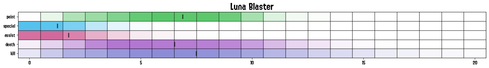
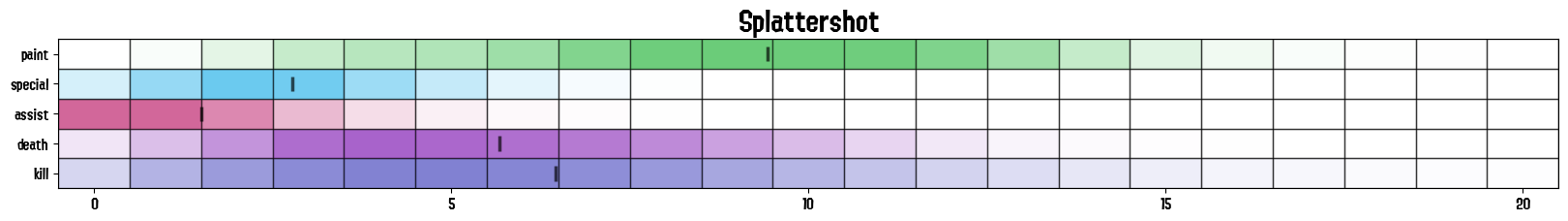
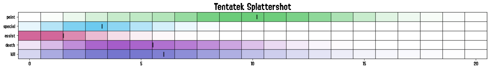
 - Strips_S.png)
 - Strips_S.png)
 - Strips_S.png)
Future Work
The full code to do these plots, along with the previous stat.ink posts ones, is available here. I still need to finish up the docker image and clean up some of the functions so that they are more customizable, but I’ll get to it in the following weeks. I’ll also add an alternate function that allows to export the stats for the weapons individually as follows:
so that it’s easier to compare them on a one-to-one basis and across stats.
Code Repo
- Repository: Github Repo
- Dependencies: matplotlib, pandas, numpy, dill, termcolor, colorutils, tqdm, scipy, DateTimeRange, pywaffle, squarify