A 3 day data-visualization bootcamp that I designed for professors in my alma mater, Tecnológico de Monterrey.
Introduction
I was hired to teach a data visualization bootcamp on my former university using the programming languages: Mathematica, R, and Python. This was a bit challenging because, even though I am reasonably proficient with the three languages, I tend to prefer Mathematica and Python over R; and jumping from one language to the other on the fly was a bit confusing sometimes.
Objective
The main objective of the course was to provide datasets and exercises on a wide array of data visualization techniques for course-takers to develop some of the basic skills required to transform and visualize data into meaningful plots. This was not an in-depth course, as it was aimed at participants with different backgrounds and skillsets (from humanities to engineering and computer science); and as such, it was geared towards having the audience take code snippets, put them together and customize them so that they could start developing a sense on which kinds of datasets tend to be better represented by a given plot type.
Content
In addition to over 20 plotting coding exercises, the course covered these subjects: image formats, data formats and sources, python and anaconda, color palettes, dataviz good practices, github, markdown and HTML, github-pages, ffmpeg. In which the participants alternated between doing exercises and listening to explanations with tips and tricks to convey information more efficiently. This helped keep the bootcamp dynamic, as sessions were 8 hours long, which made it challenging to keep engagement and energies high.
Select Exercises
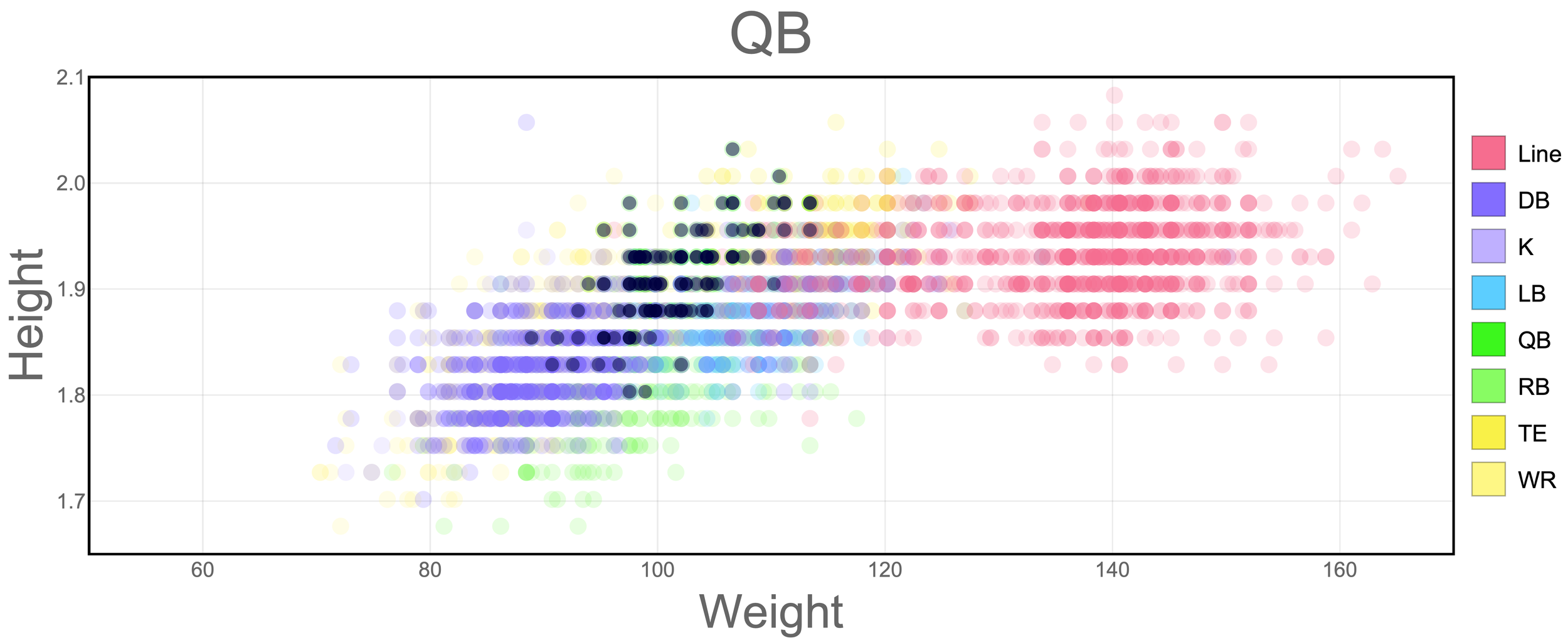
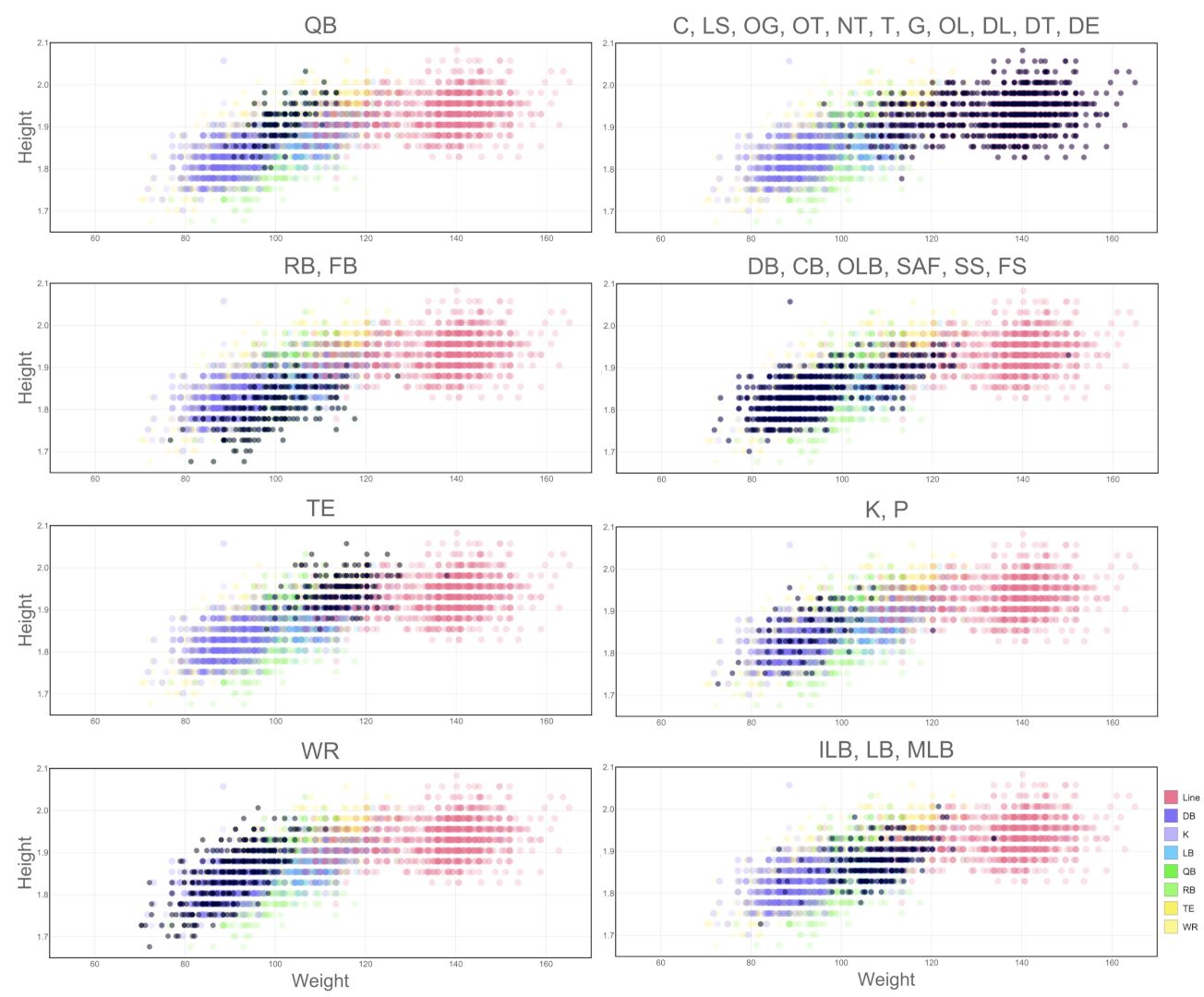
NFL Players Size
I like NFL, so when I got a hold of a CSV file with player’s stats, I decided to use it for one of the exercises. The idea in these panels is to compare the player’s weight and height across the different groups of player positions.
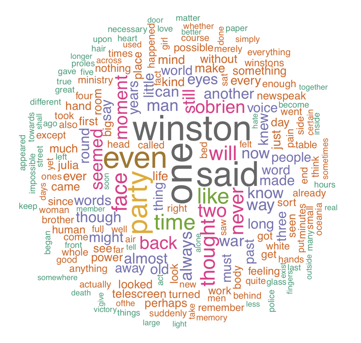
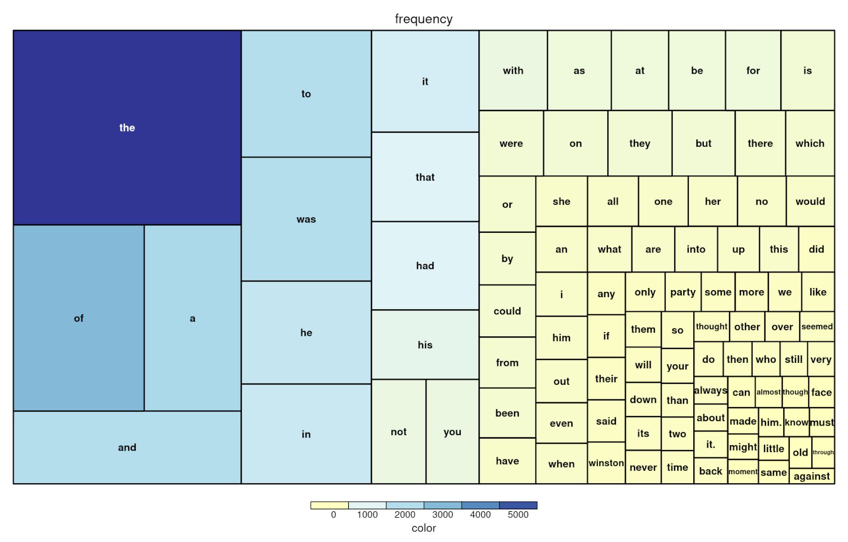
1984 Wordcloud and Treemap
To exemplify some ways to do frequency-based representations of data, we did an exercise with the text of my favorite book “1984” by George Orwell.
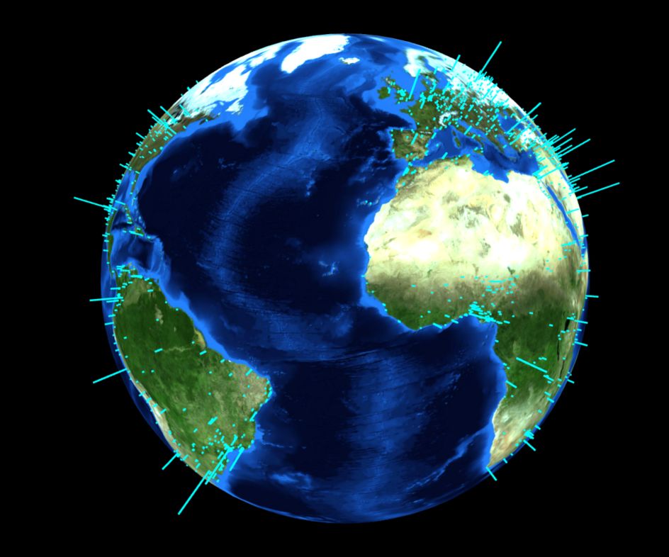
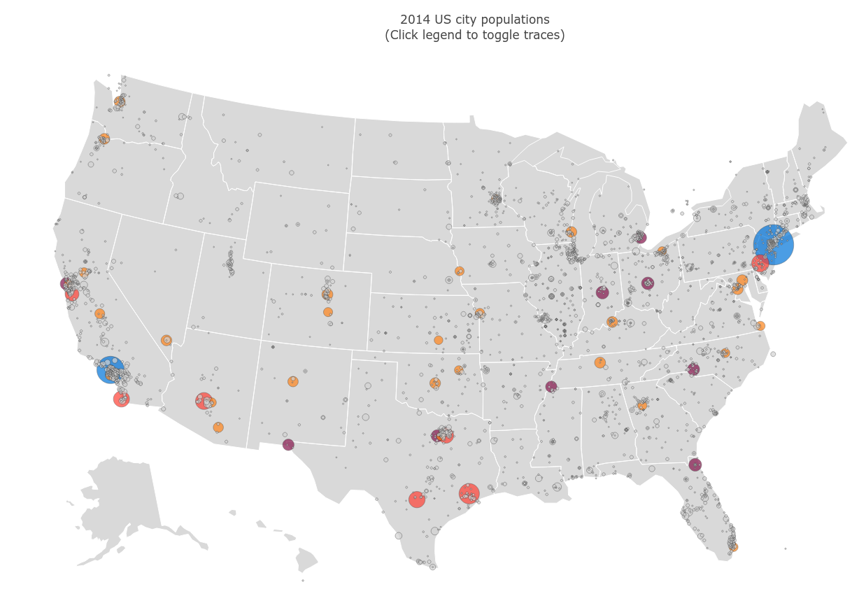
Cities
We did some spatial data exercises, including an interactive globe with the largest cities in the world, and a map of the largest cities in the US:
Topics and Code
As I mentioned before, we did a bunch of exercises. The full list with links to the code can be followed here:
- Time Series: Stochastic traces (Mathematica), Stacked area (Python and R), Digraph (R), Stream chart (R)
- Counts: Box-whisker chart (R), Violin plots (R), Wordcloud (R)
- Scatter: Scatter plot (Mathematica), Bubble chart (Python), Scatter plot with histograms (Python)
- Transitions: Heatmap (Mathematica), Chord diagram (R), Random network (Mathematica)
- Factorial: Density plot (Mathematica)
- Geographic: Leaflet (R), Folium (Python), Globe plotting (R), Bubble map (Python), Fancy map (Mathematica)
- Clustered: Tree map (R), Random networks (Mathematica)
With the whole sitemap available in the following link.
Code repo
- Repository: Github repo with all the materials and exercises