MK8D pypi
Going back to the MK8D Speedrun analysis code, I realized I should’ve created a tool that converted the XML (LSS) code into manageable dataframes. This would allow much more flexibility in the processing than the current dictionaries implementation. With this in mind, I finally decided to create a pypi package. In addition, the plots routines were ported from matplotlib to plotly for more interactivity.
Development
The first step in creating the dataframes was to read the original LSS file. In doing so, there were some decisions to make in terms of what’s the information that would be useful in terms of speedrunning analysis. After some thinking and with some prior experience on the previous iterations of the routines, I decided upon the following data columns:
- ID: Run ID
- Track: Mario Kart track name
- Time: Track timing (in seconds)
- Version: Cartridge/Digital
- Items: Items/No Items
- Speed: 150cc/200cc
- Category: Nitro/Retro/Bonus/32/48
Now, the LSS file stores the time taken in each split on the run, but not the aggregate time up to that point. With this in mind, and to streamline the analysis, I decided to store two different dataframes into CSV files: tracks and runs. The former contains the timing information of each individual track, whilst the latter stores the time taken up to that track (which needs a tracks order to be provided). Now, for the runs CSV there were a couple of columns added to the dataframe and a minor change to the Time column:
- Time: Cumulative timing from start of the run up to the end of the track (in seconds)
- Center metric name: For runs stats purposes, this column holds the “center” of the runs up to this point (mean, median, min, max are out-of-the-box options for now, although minimum modifications are needed to extend this). This is particularly useful to plot runs traces (as will be explained in the next sections).
- Center offset: Time (in seconds) that needs to be added to the “center” to obtain the run’s real time (as dictated by the Time column)
- Split: Human-readable version of the Time column (not strictly needed and with a miss-leading name but it’s useful for plotting and debugging)
It is worth noting that the Speed, Items, Category and Version columns are optional and can be deactivated from the parsing if the LSS file does not contain that information.
With those categories and ideas in mind, the first step was to code the parser to convert the original XML-based LSS files to dataframe CSV. I won’t go into much detail on this because it’s not really fun work but these preprocessed dataframes are intended to be independent from the data analysis phase.
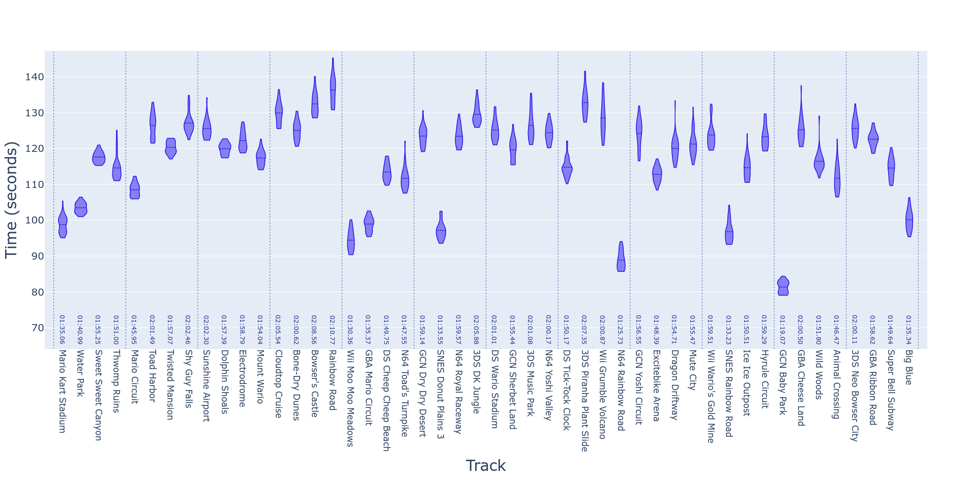
Violin Plot
One of the most useful plots to understand the improvement and possible time-saves for individual sections of runs would be one that showed the distribution of times across each attempt. A natural way to show this is a violin plot. Although a whisker-box chart would probably do the job, a violin plot has the advantage of showing not only the quantiles of the distribution of times but the full shape of the distribution. Getting this plot from the TRKS dataframe is fairly straightforward, as we just need to parse the Time column for each Track. Additionally, we can split the violins on another variable such as Version.
Traces Plot
Another fundamental plot for tracking the progress of the runs is the “traces” plot. In this graphic, we draw a line for each finished attempt at the runs. Doing so, however, is not very useful as it ends up being a bunch of lines trending upwards without much separation from each other making them nearly unintelligible (although the package does provide the tools to plot them). A better way to show the same information is to “center” the traces on some metric (mean, min, max or median), which is why the Center column is provided in the RUNS dataframe. In this version of the traces, each track is shown with the y axis’ origin being the summary statistic as calculated across all the attempts, and the distance of each independent trace is the difference of the trace from the statistic. For example, if in “Mario Circuit” our average time is ten minutes, a difference of 30 seconds from this time would be shown as a distance of 0.5 minutes from a given trace to the y axis, whilst the “mean” run (trace) would be completely centered on the same axis.
Finally, to make this plot more readable, we make the color of each trace more “faded” the older the attempt (darker, more solid lines mean newer runs), and we highlight the PB in a different color altogether.
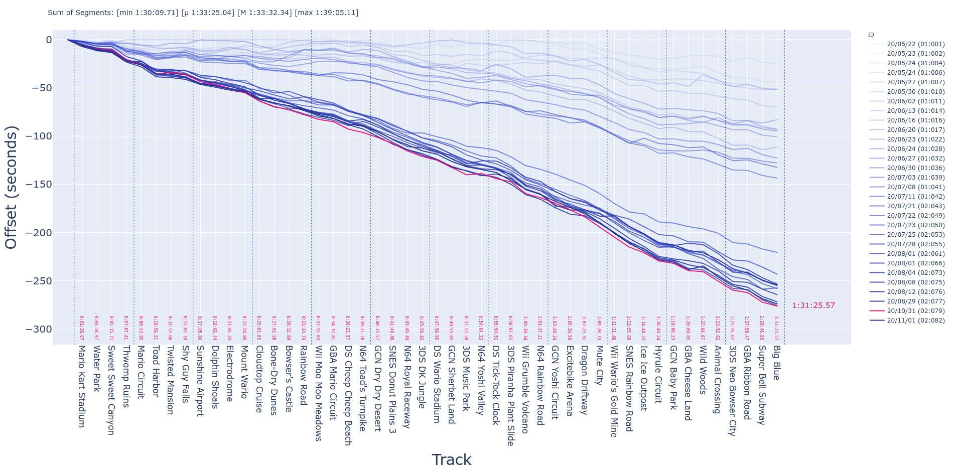
As it was mentioned before, this representation uses the information stored in the RUNS dataframe, as it uses the cumulative time of the run instead of the tracks’ times. Additional information for the “pop-ups” is needed but it’s mainly the timing information converted into human-readable format.
Progress Plot
A useful plot to track the trend in our final times is the “progress plot”. In this representation, we show the final times in the y axis and the dates they were accomplished in on the x axis. This way, we can track the improvement of our runs over time.
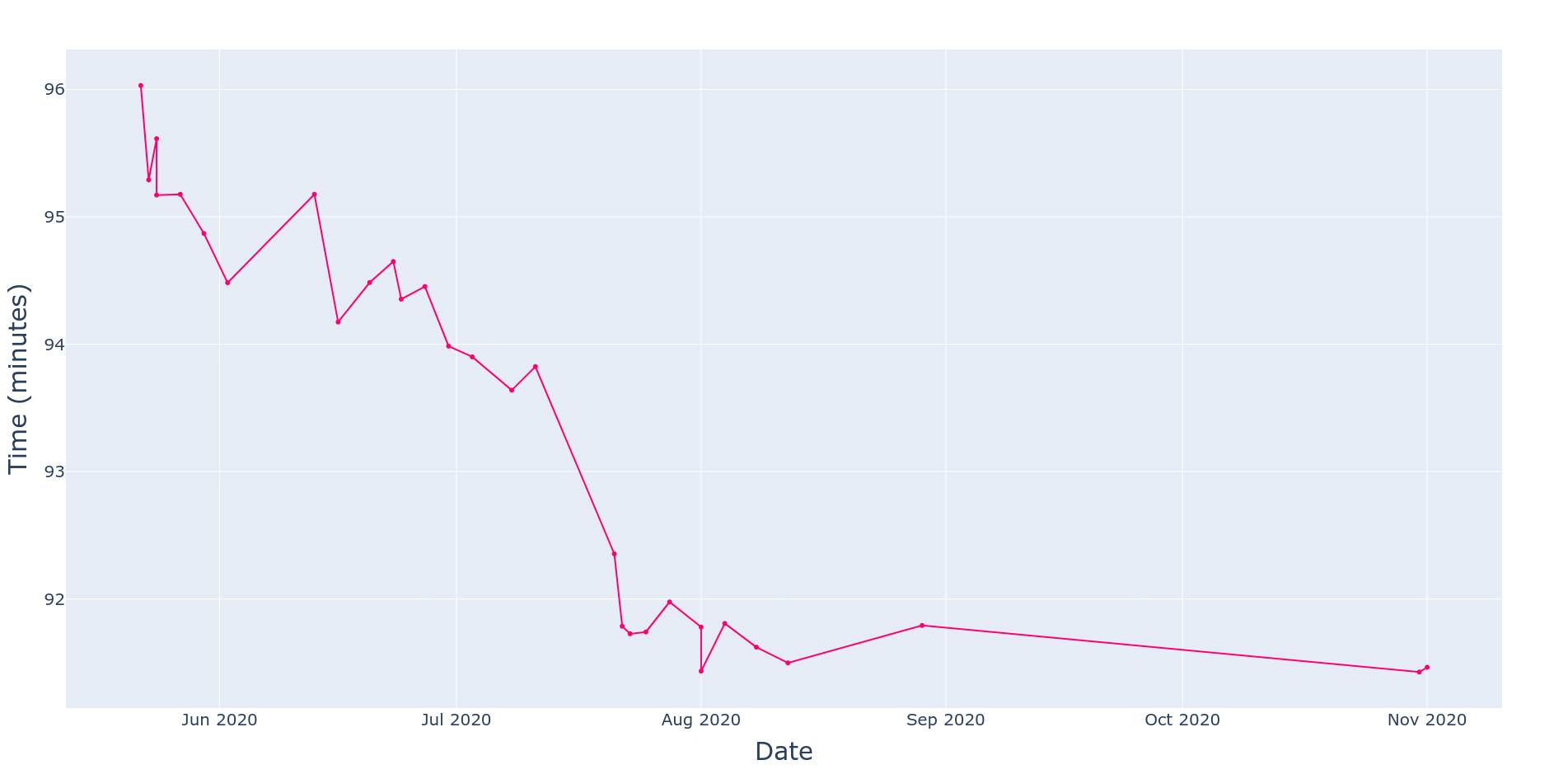
This one is pretty straightforward to create, as we just need to use the runs’ final times and the dates of the runs to plot the coordinates (along with the ID for the fancy highlights).
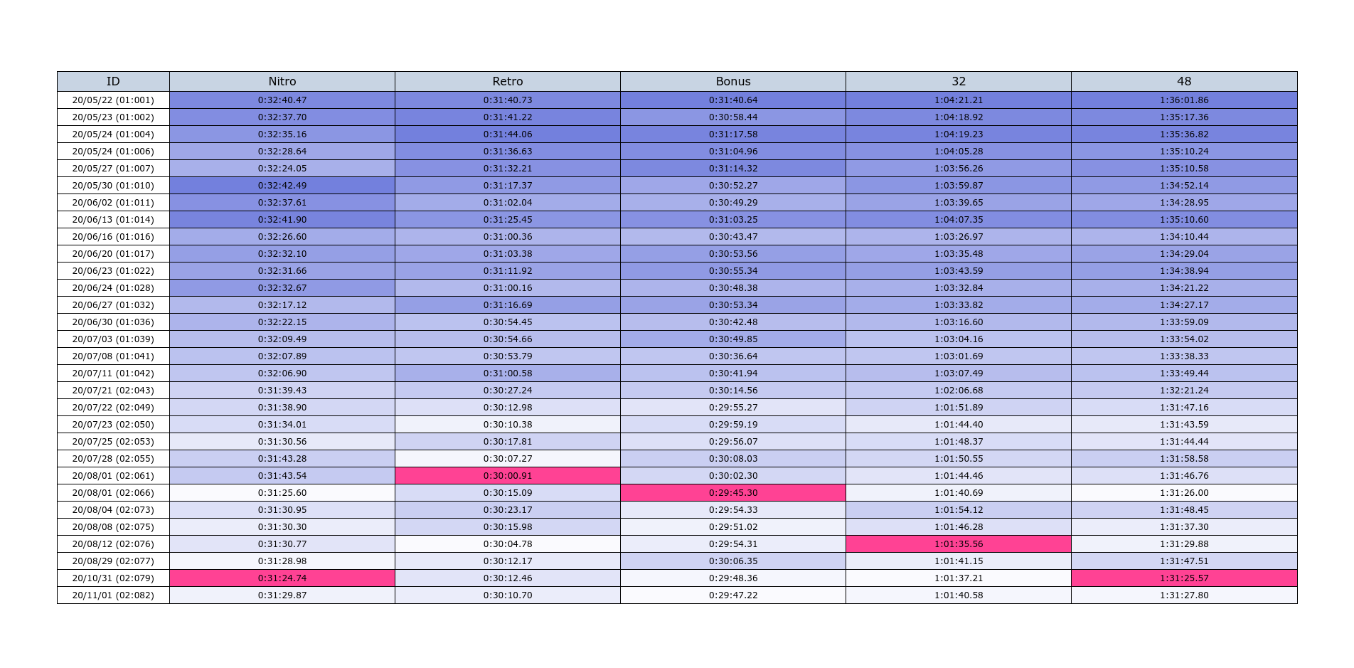
Categories Table
For runners who do the 48 tracks category (such as myself), and would like to have the times of the intermediate categories (“32 tracks”, “Retro”, “Nitro”, and “Bonus”); a table is provided with this information. This is calculated bu subtracting the cumulative time from the track previous to the one in which each category starts (this is why the “Start” entry is added to the dataframes). Again, to make the table more readable, darker tones are used for slower times and the PB is highlighted with a different color.
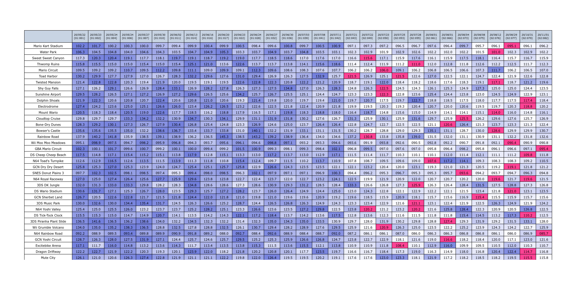
Track Times Table
Finally, for a thorough breakdown of each track, we do a table with the time achieved in every attempt of the finished runs. This also makes use of different coloring to make the results a bit more readable.
Documentation and Code
- Repository: Github repo
- Pypi:
pip install MK8D - Dependencies: Numpy, Pandas,