MK8D Speedruns (Part 3)
This is the final part of my Mario Kart Speedrunning series. These past covid-lockdown months I’ve taken to speedrunning Mario Kart 8 Deluxe and whilst doing so, the idea of coding a script and analyze the data to locate improvements and tracks that could use timing optimization. The process of putting the plots and summaries together can be found in my first and second post on the subject. This one is more of an interpretation and summary of the idea.

Development
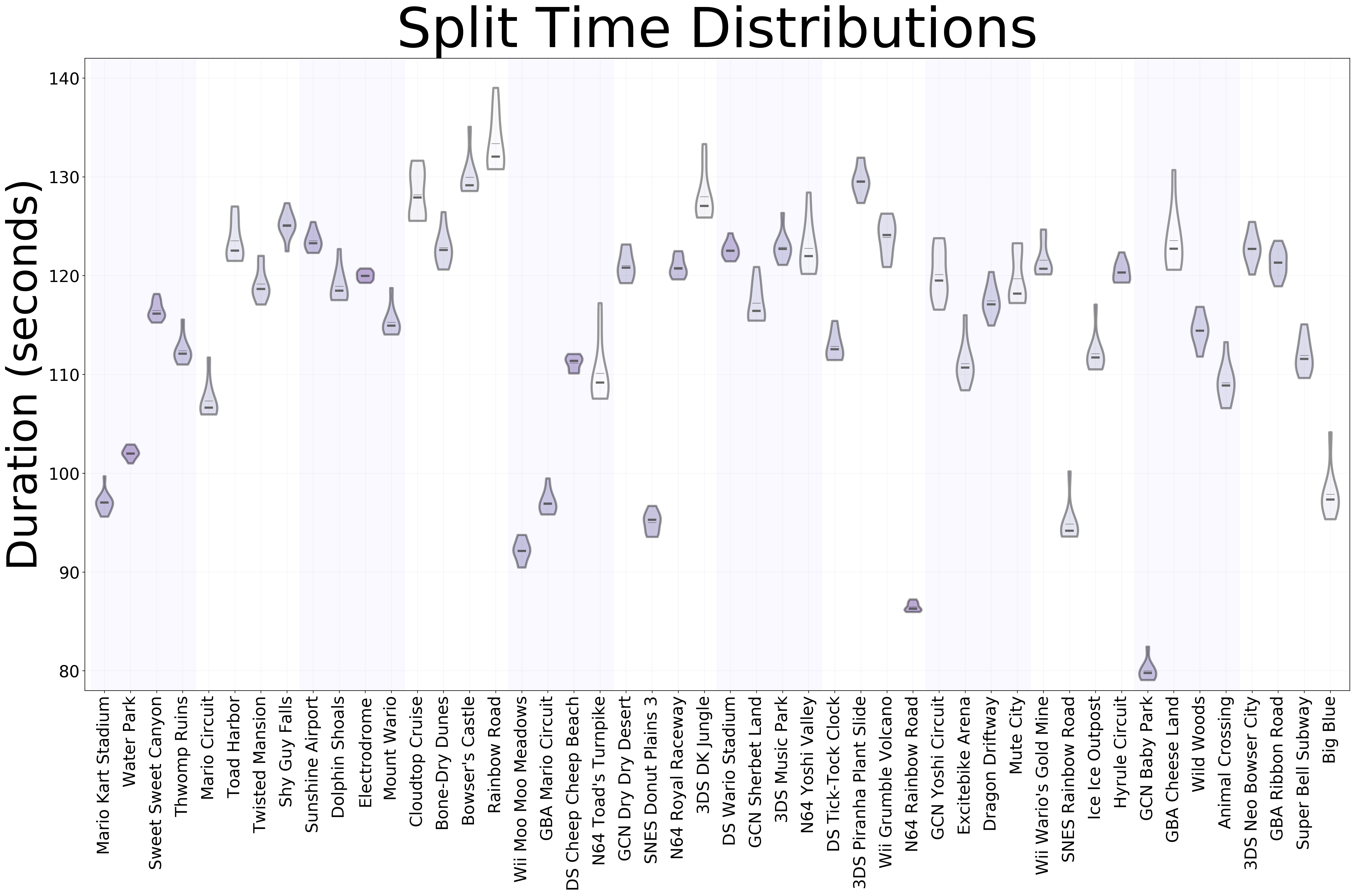
The first plot to be developed was the split times violin chart. This one is an enhancement of the whisker-box plot provided by splits.io. I personally dislike whisker-box charts because they lose important information on the specific underlying statistical distribution of the process that generates them. In this case, being able to look at the distribution of times can provide information, as having a truncated shape towards the bottom usually means that most of the time we obtain the best time on our runs and only some other times we fail (elongated tail). Conversely, if we have an elongated rectangular shape, it means that that track might need some practice so that we can get our best times with more consistency.
Other noteworthy things are the location of the median with respect to the mean, and the standard deviation. In the case of the former, as the median is more resilient to outliers, a “faster” median means that even though we might have had some costly mistakes in some runs, in general we do fine. In the case of the latter, the standard deviation is highlighted with color (white is higher deviation), so the whiter tracks need more practice for concistent times.
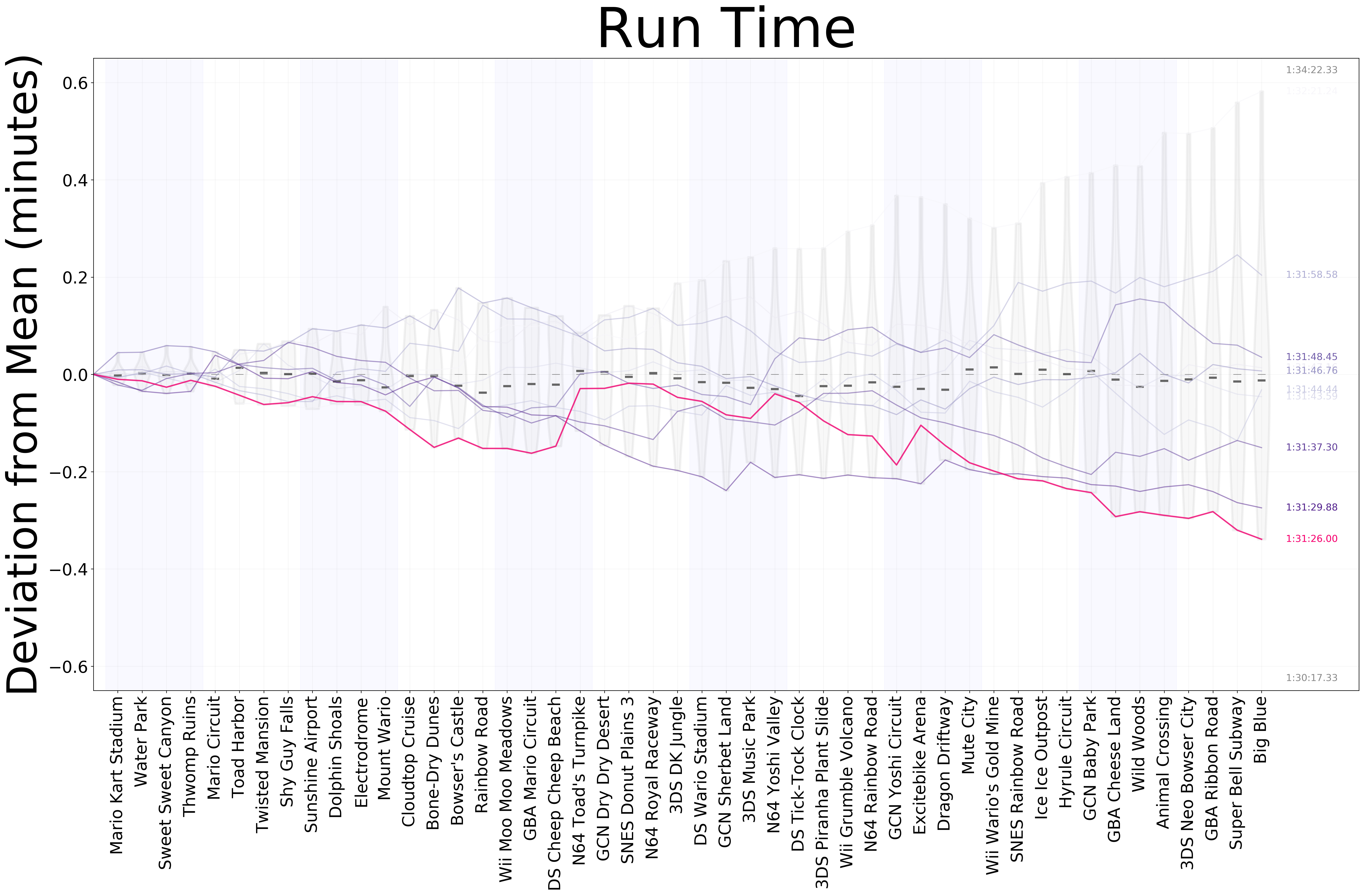
Being very much into doing 48-tracks runs, I was ultimately curious of looking at the differences between my runs over time. The first time I tried to do this, however, resulted in a horrible, ever-increasing set of lines that provided almost no information other than the general trend of each run. After some thinking, I decided upon centering the trend over the mean time at each split, meaning that drawing a horizontal line on the y-value of 0, would show the “average run”, and any deviation up and down would be a worsening or improvement (in order) upon the mean. Once that was settled, I noticed that having a bunch of lines in the same plot made extremely difficult to understand what was happening with any particular run, so I used colormappings to make older runs whiter with respect to newer ones. Finally, I highlighted the “personal best” run with a different color and added the sum of worst and best times on the top and bottom of the final run.
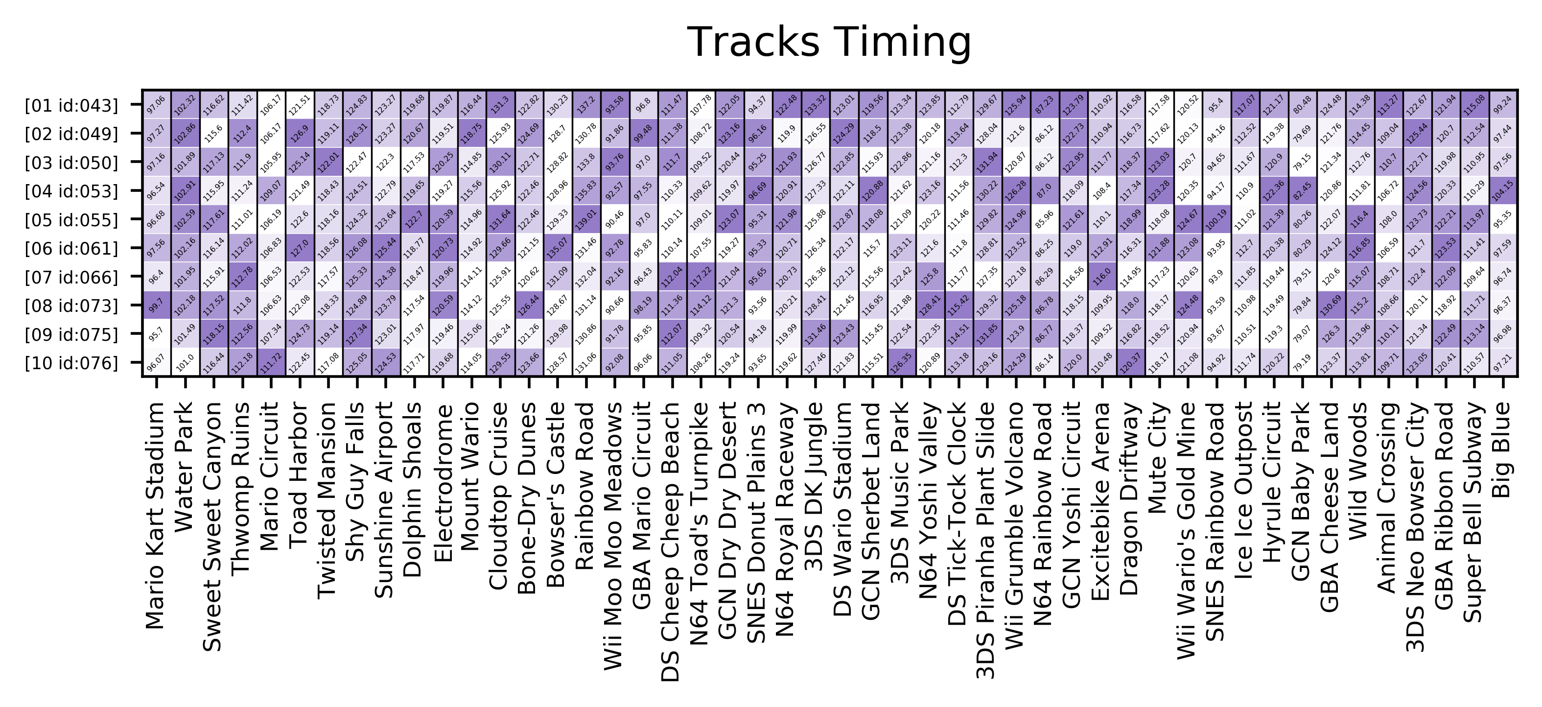
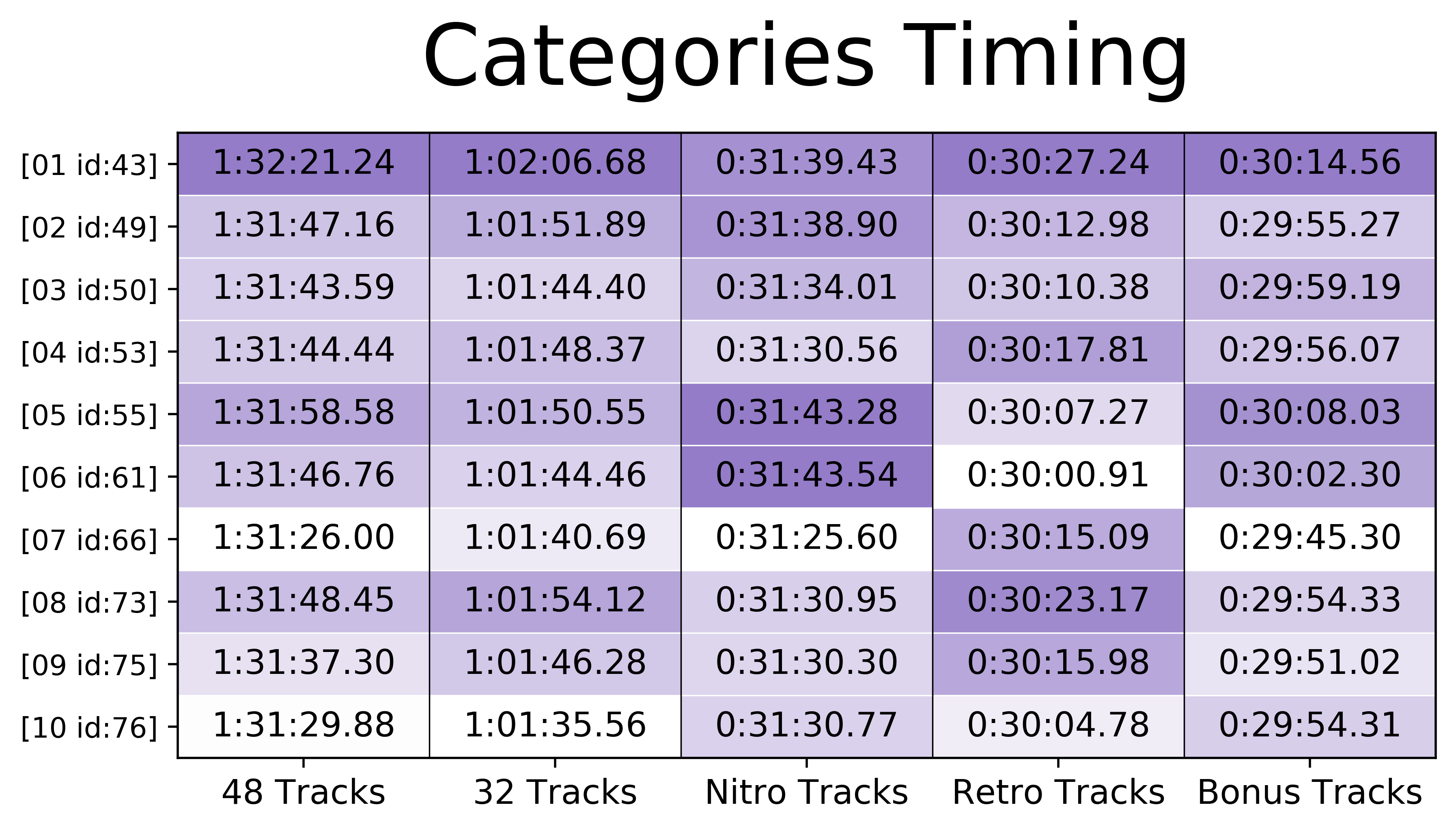
Sometimes, after finishing runs I was curious as of how the inidividual times of the tracks compared to previous attempts. The initial iterations of this comparisons involved large tables of timings, but it was not very useful. To improve upon this idea, I did a heatmap with the timings per track, where each column has the color normalized by the times obtained in each segment; and each row represents one full run. The color of the cells is log-scaled to make it easier to read (as most of the distributions tend to be truncated towards the minimum times having a “bad time” outlier made it hard to distribute colors appropriately). This plot provides a nice-looking “fingerprint” of all the runs.
Finally, to track the progress of the final times over time for the categories supported on the speedrun.com leaderboards I pretty much repeated the process for the previous heatmap but with the specific rulesets defined by the community.
And that was it for now. The code needs some improvements for usability but I’m happy where it stands. I’ll revisit it to add more features if I get more time.
Special thanks to Yami (@yamischan) for the speedrunner banners!
Documentation and Code
- Repository: Github repo
- Dependencies: xmltodict, matplotlib